
One of my favorite things to do when I get a new stamp set is look at all of the elements and think about what I could do with the images DIFFERENTLY than what they were originally intended. The Pretty Little Things set from Scrappy Boy Stamps has so many fun elements…….like the cute little teddy bear, the toy train set and the rocking horse.
I decided to challenge myself and make a card using only one element from this stamp set, the teddy bear. This teddy bear can be used in so many ways, like as kid’s best friend, in my first SBS card post, safely tucked into his dresser drawer or like one of my all time favorite crafting candies, gummy bears!
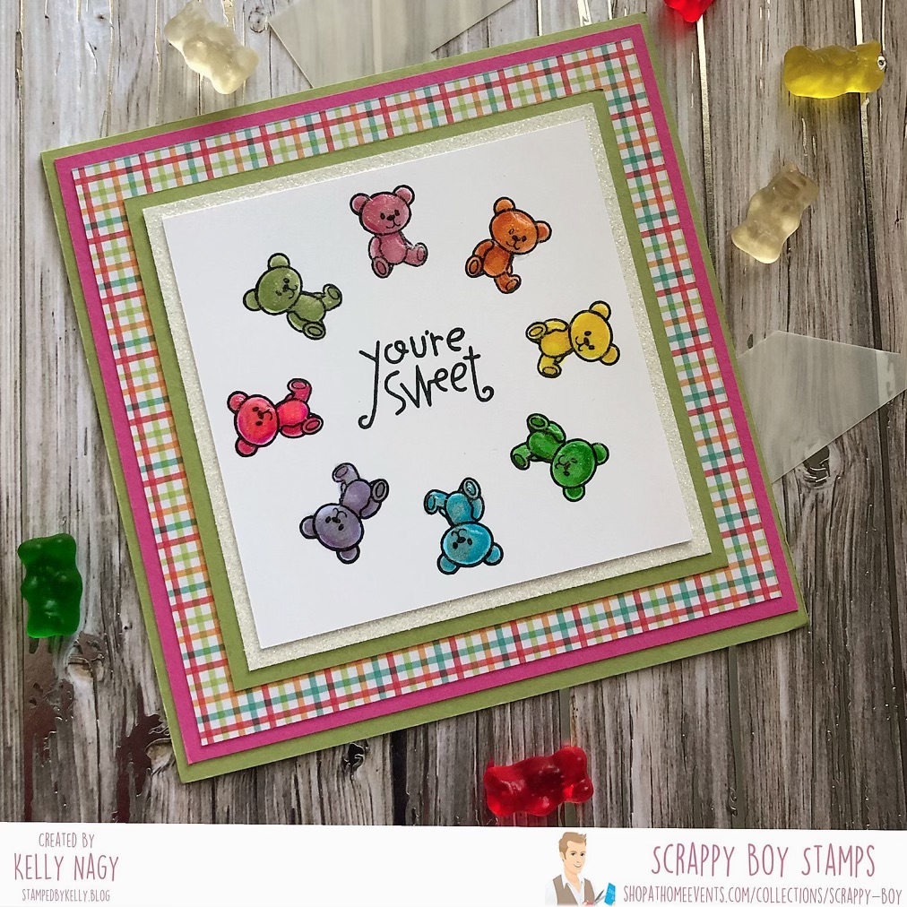
When you have smaller elements from a set that you would like to feature on a card, I have found one of my favorite ways to do this is by using a stamp positioner and a wreath-builder stencil like one from Gina K Designs.
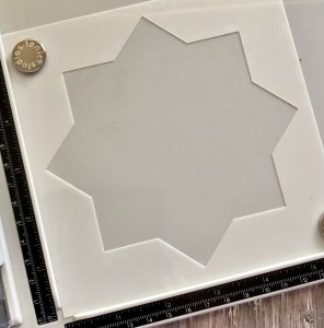
Place the stencil in your favorite stamp positioner.
I started by cutting a piece of white Sweet Sentiment Paper 4 inches by 4 inches square. I placed the wreath-builder stencil securely in the corner of the stamp positioner, then placed the 4×4 square piece of paper in the stencil opening and lined up my bear stamp on the paper and picked up the stamp with the positioner. I inked up the bear with Simon Says Stamp Intense Black Ink and stamped the bear in my Tim Holtz Stamp Positioning Tool. I then rotated my 4 x 4 inches square piece of paper, continuing to re-ink and stamp my image until I had stamped the bear in a complete circle to form a wreath. I wanted to make an all occasion card and came across one in my craft supply arsenal that said, “You’re Sweet” and used my stamp positioner to carefully center the sentiment in the middle of the gummy bear wreath. This sentiment is from an older Paper Smooches set called “Giddy Gumdrop.”
Then, I colored up my images using rainbow colors from my Copic collection as follows:
- Dark Pink: RV02, RV09, RV14
- Light Pink: R85, R81, R83
- Orange: YR02, YR16, YR18
- Yellow: Y02Y08, Y19
- Light Green: G00, G14, G24, G43
- Dark Green: G07, G14, G24
- Blue: B00, B60, BG05
- Violet:BV00, B63,V000, V15
When I colored the bears, I tried to leave the nose/snout part of the bear lighter, so that it gave more dimension. I thought that the dimensional bear would have their nose sticking out some and catching the light reflecting off of it, so that part of the bear was lighter, as well as the center of his tummy. I then wanted to give my bears a little sparkle and use a Wink of Stella Clear Pen to apply a little glittery shimmer to them. I finished the bears by applying Hero Arts Lacquer Pen to apply the crystal clear glaze over the bears and allowed to dry completely.
To complete my card, I double-matted my colored 4×4 piece with the bears using some white glitter cardstock, some FSJ/Spellbinders lemongrass cardstock. I then created the main card base out of the same lemongrass cardstock forming a 7.5 in x 7.5 in square base. I then cut another piece of FSJ/Spellbinders watermelon fusion cardstock 7.25 x 7.25 inches square. I then rummaged through my massive collection of patterned paper to select a plaid pattern that coordinated with the colors of my bears. This was cut down to 7×7 inches square and assembled all the various layers to finally form my finished card.
I did go back and forth wondering if I should add some spatter or some sequins, but I loved these bears so much and wanted them to leave it simple and clean…..and let them stand out on their very own. Do any of you struggle with knowing when to stop or letting your image stand out on their own by “embracing the white space?” Leave your response below…I’d love to know!
Thanks for stopping by and don’t forget to get crafty!
