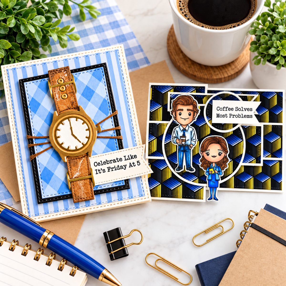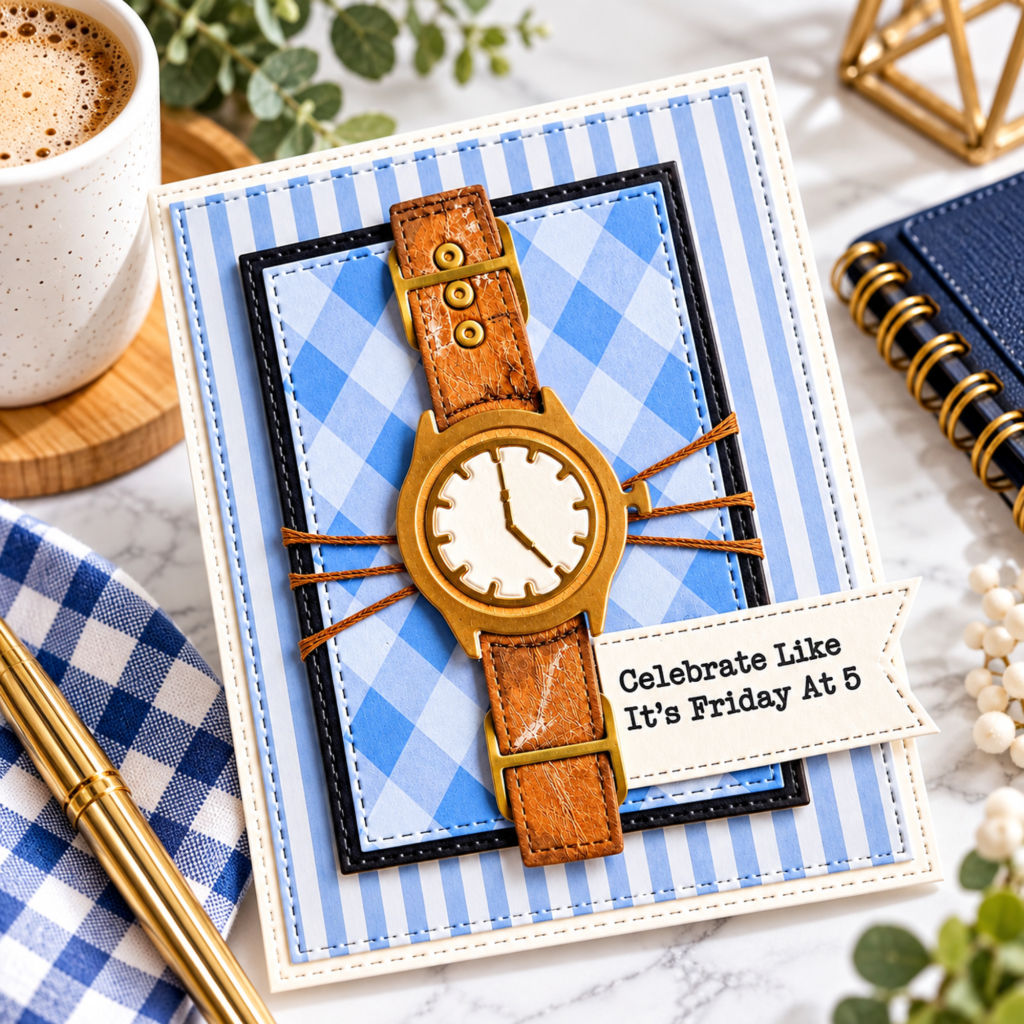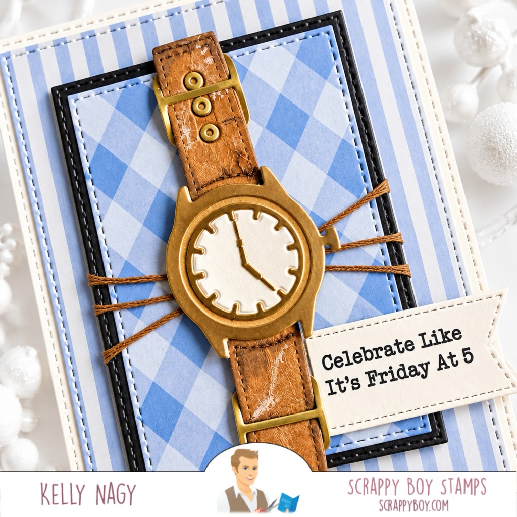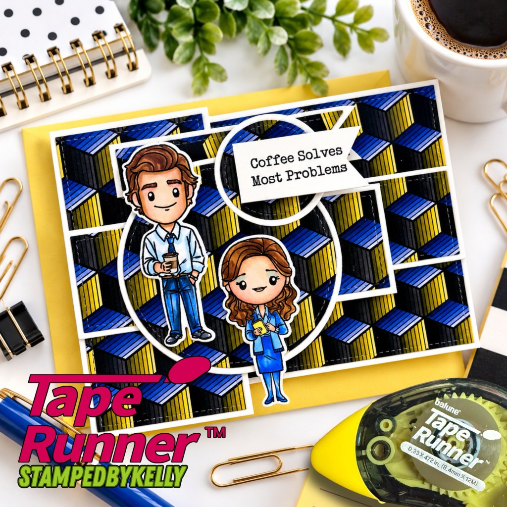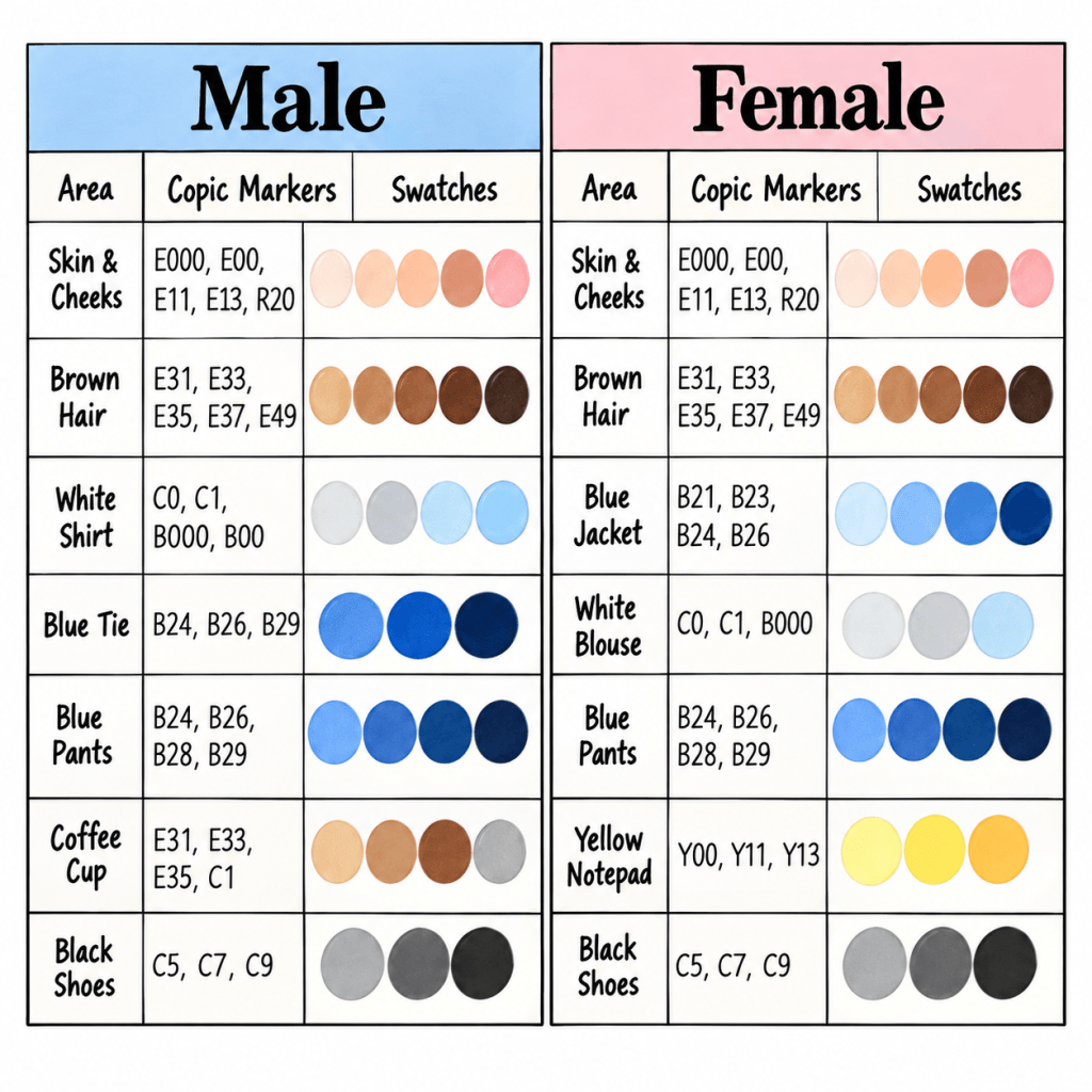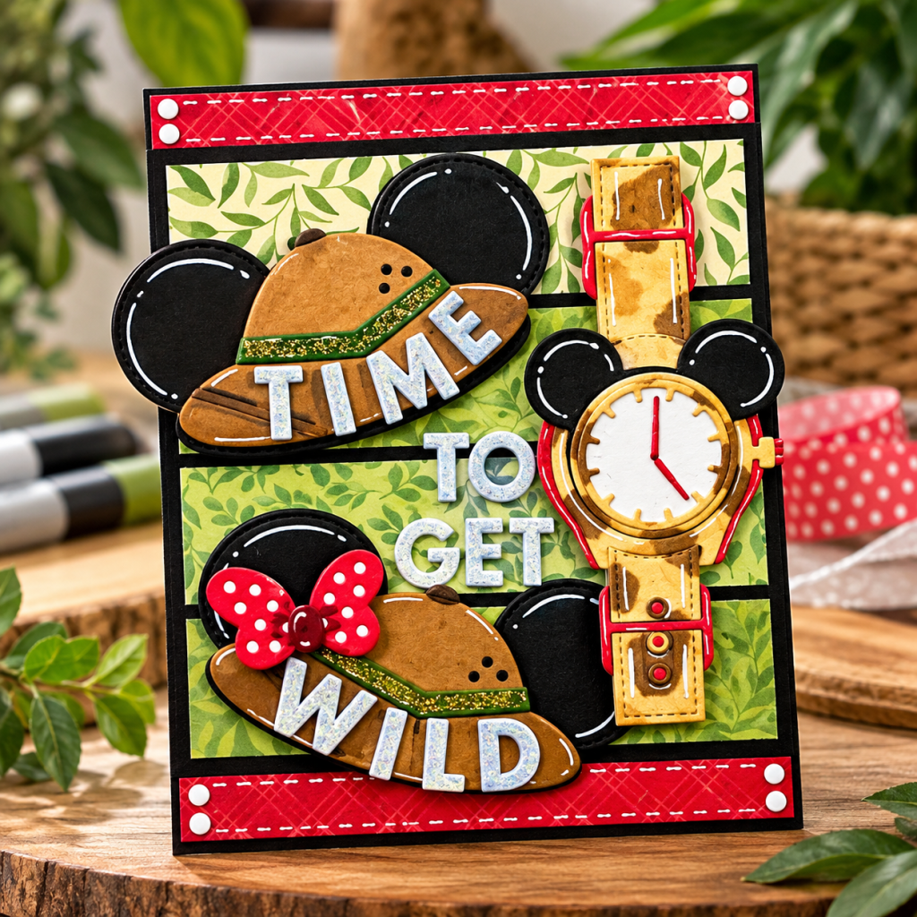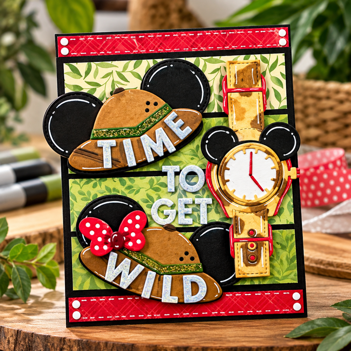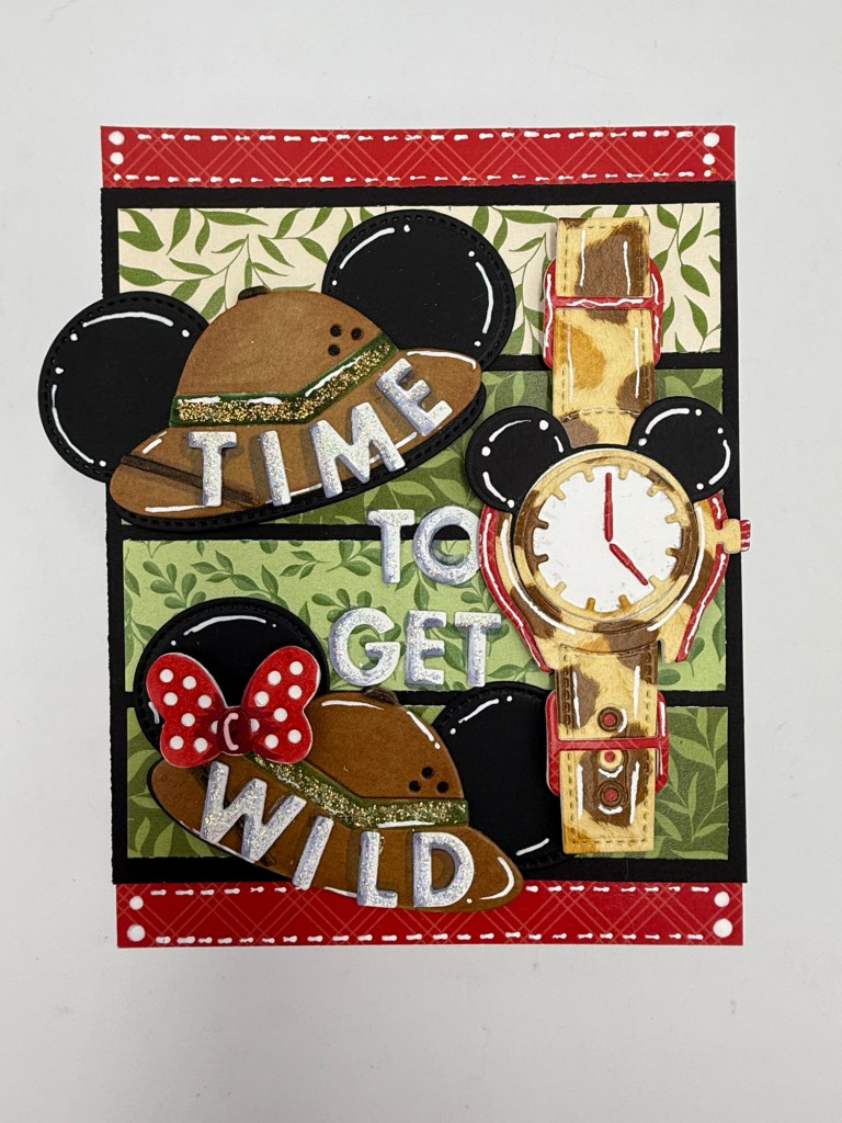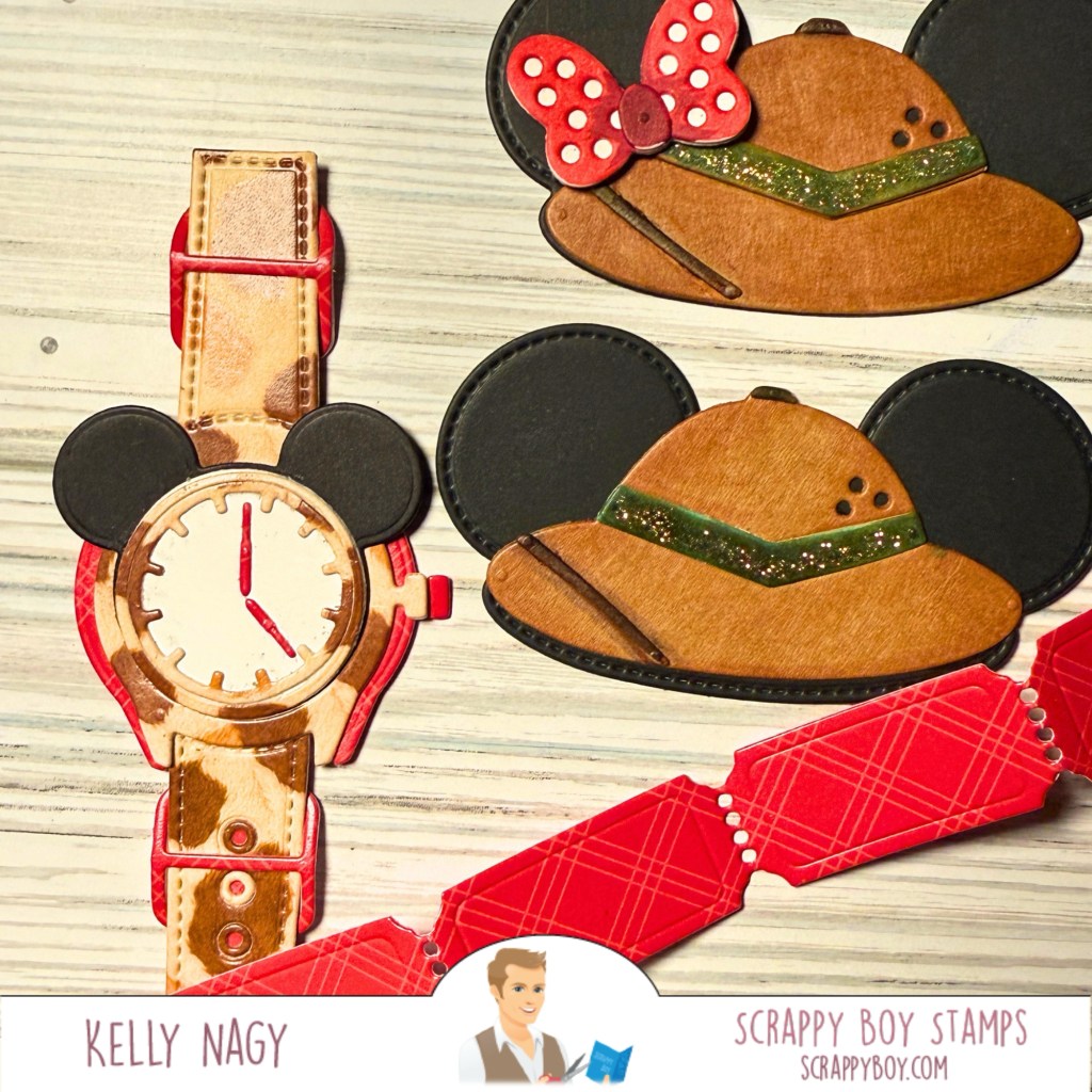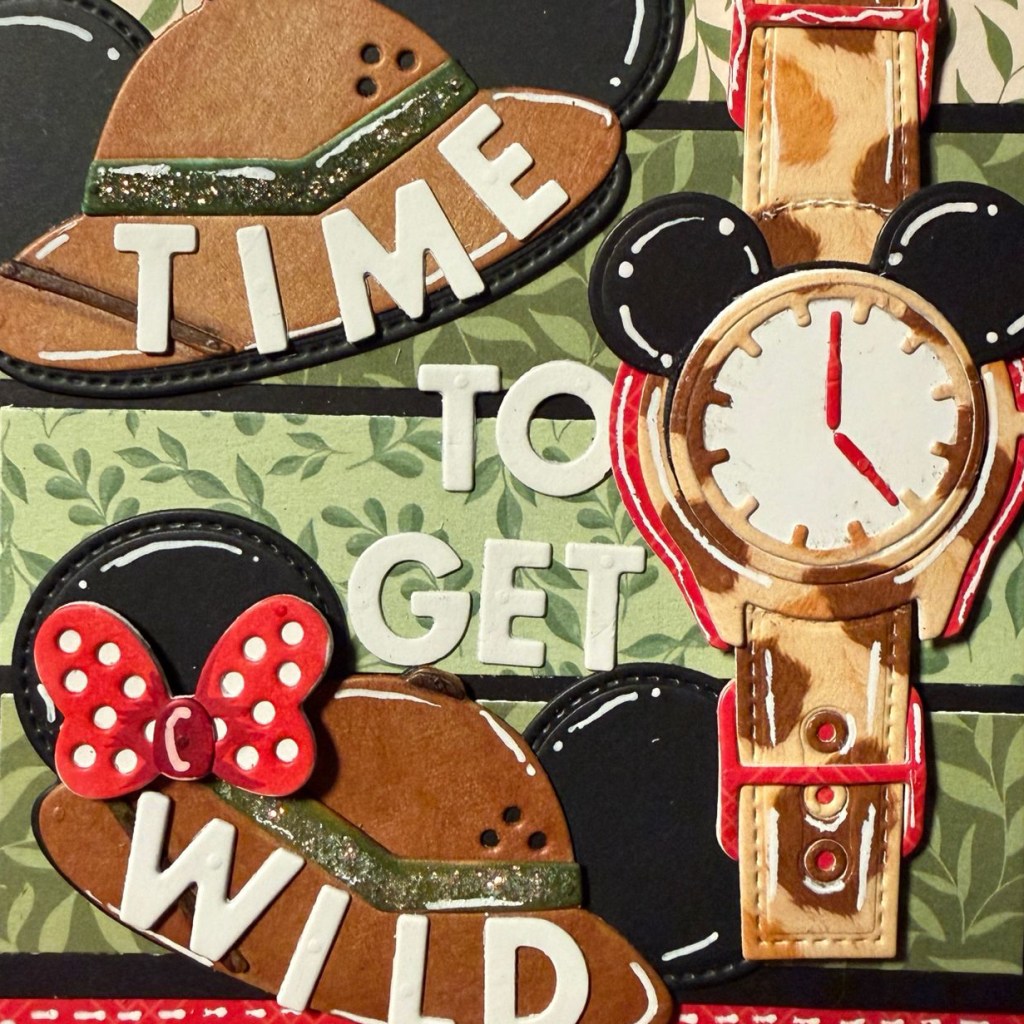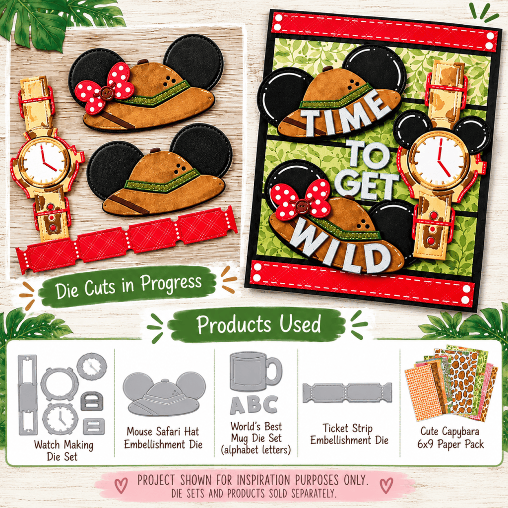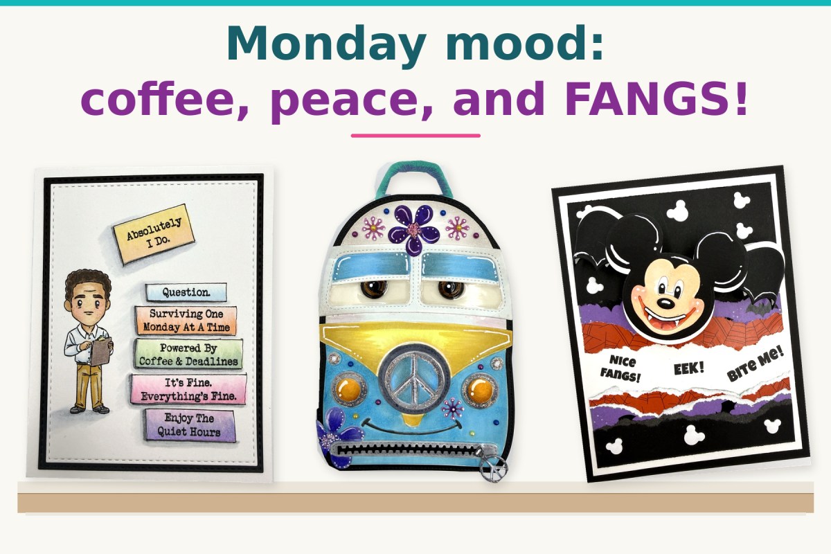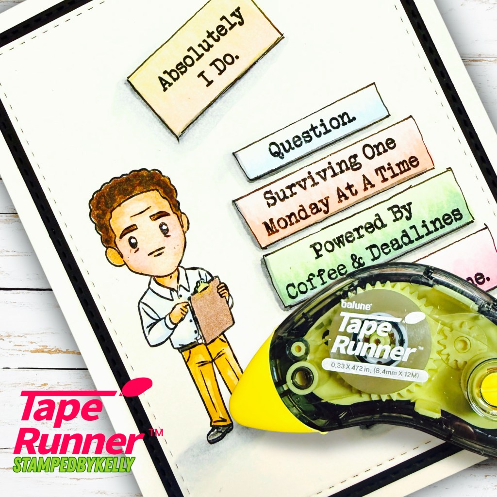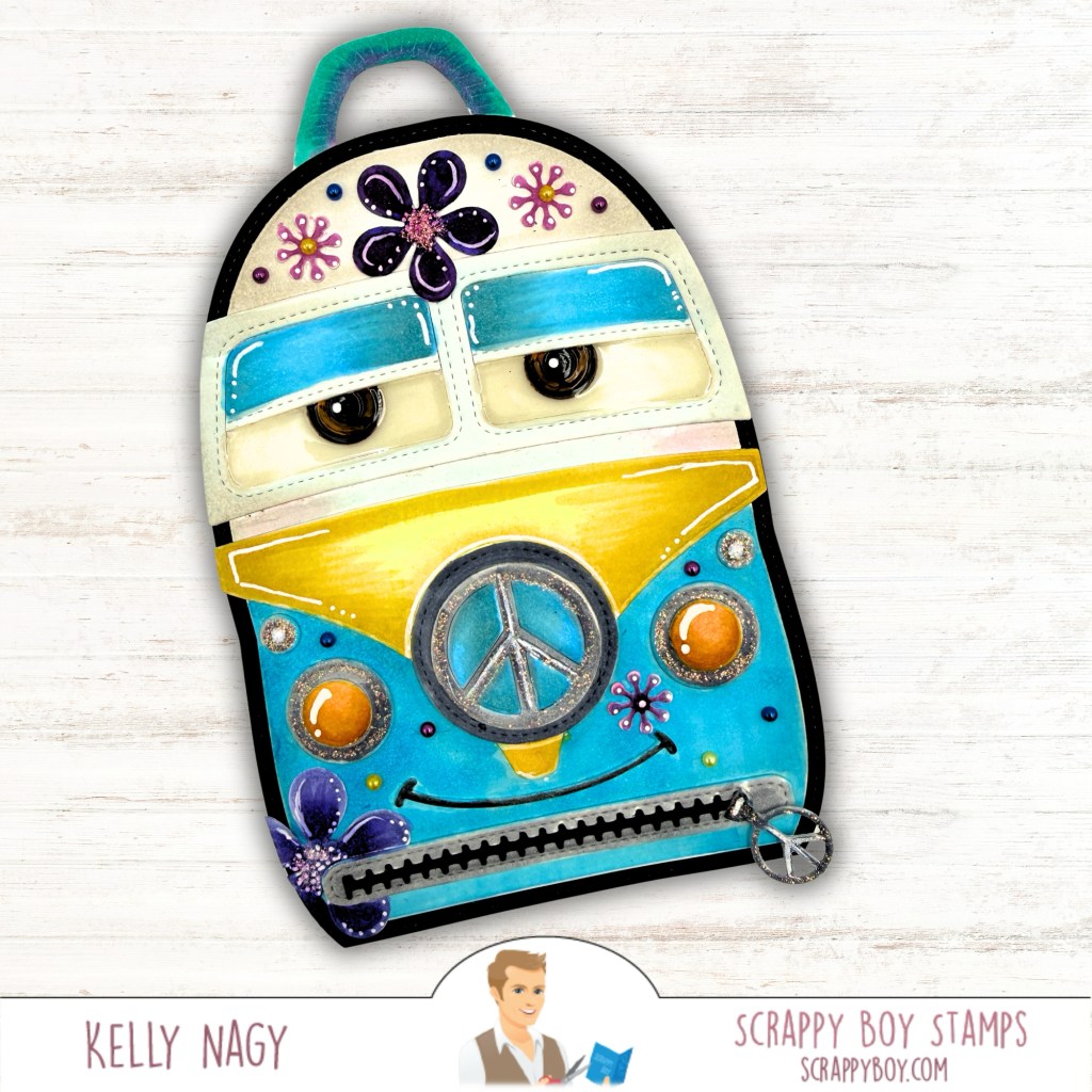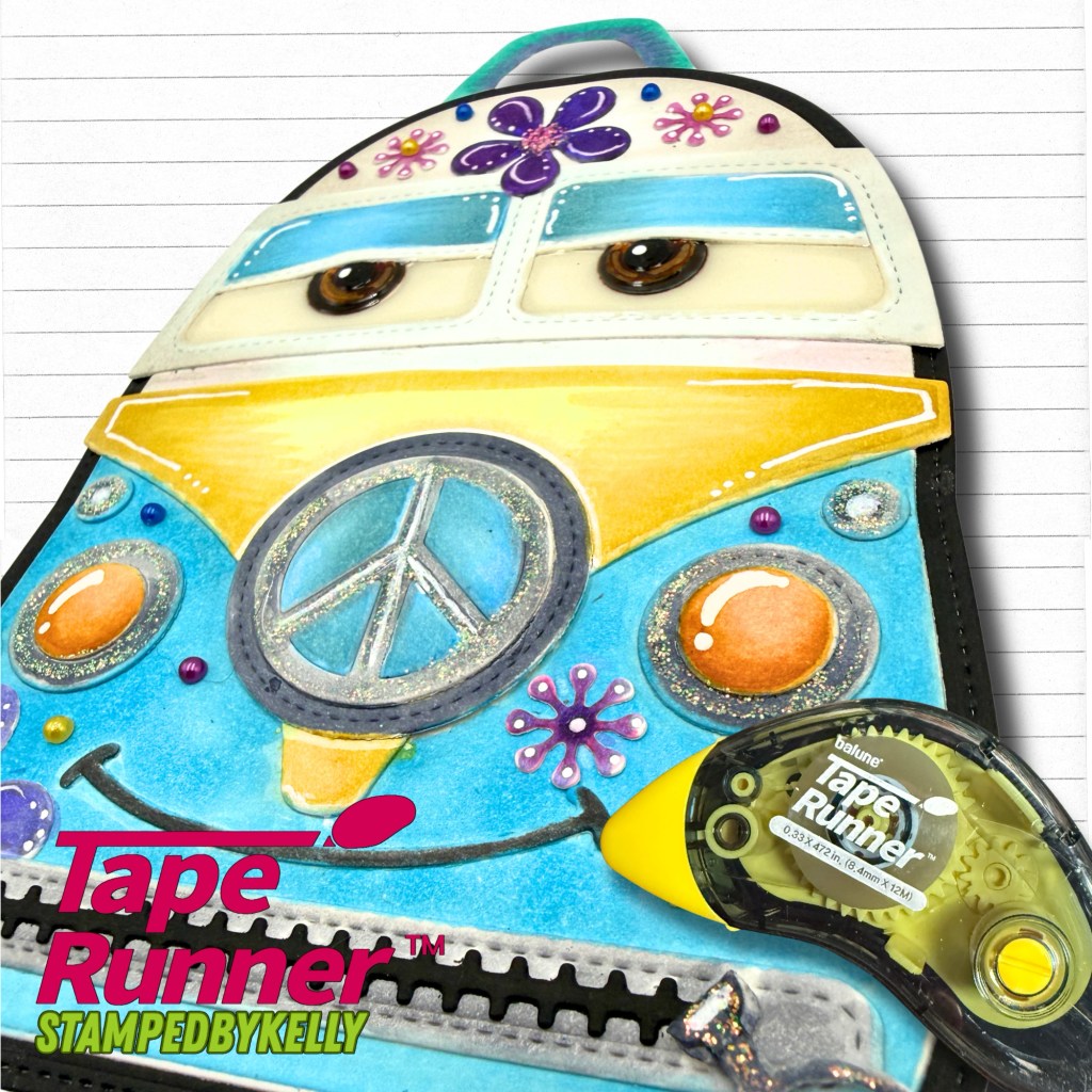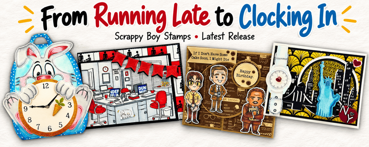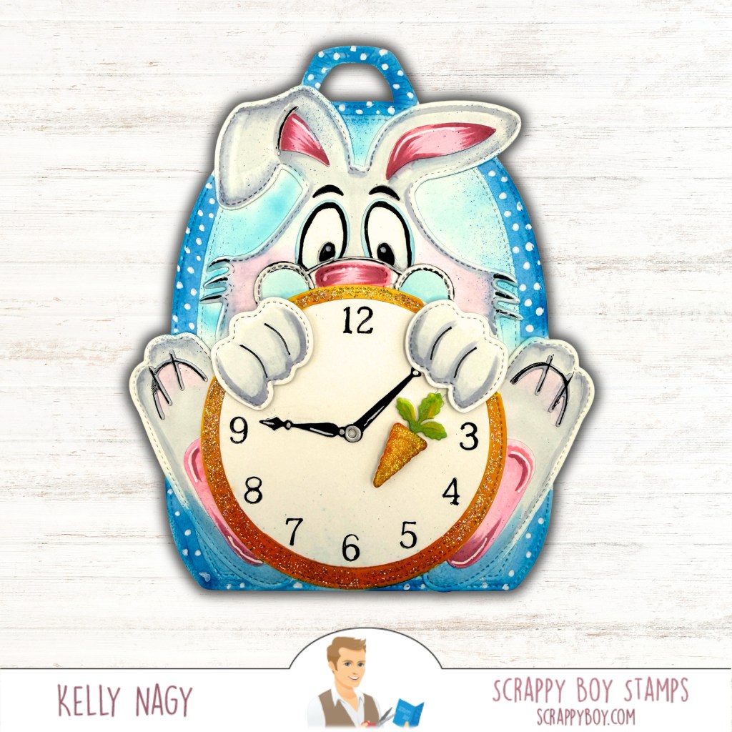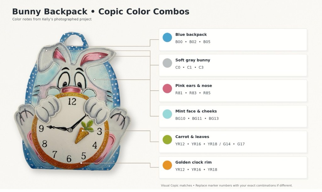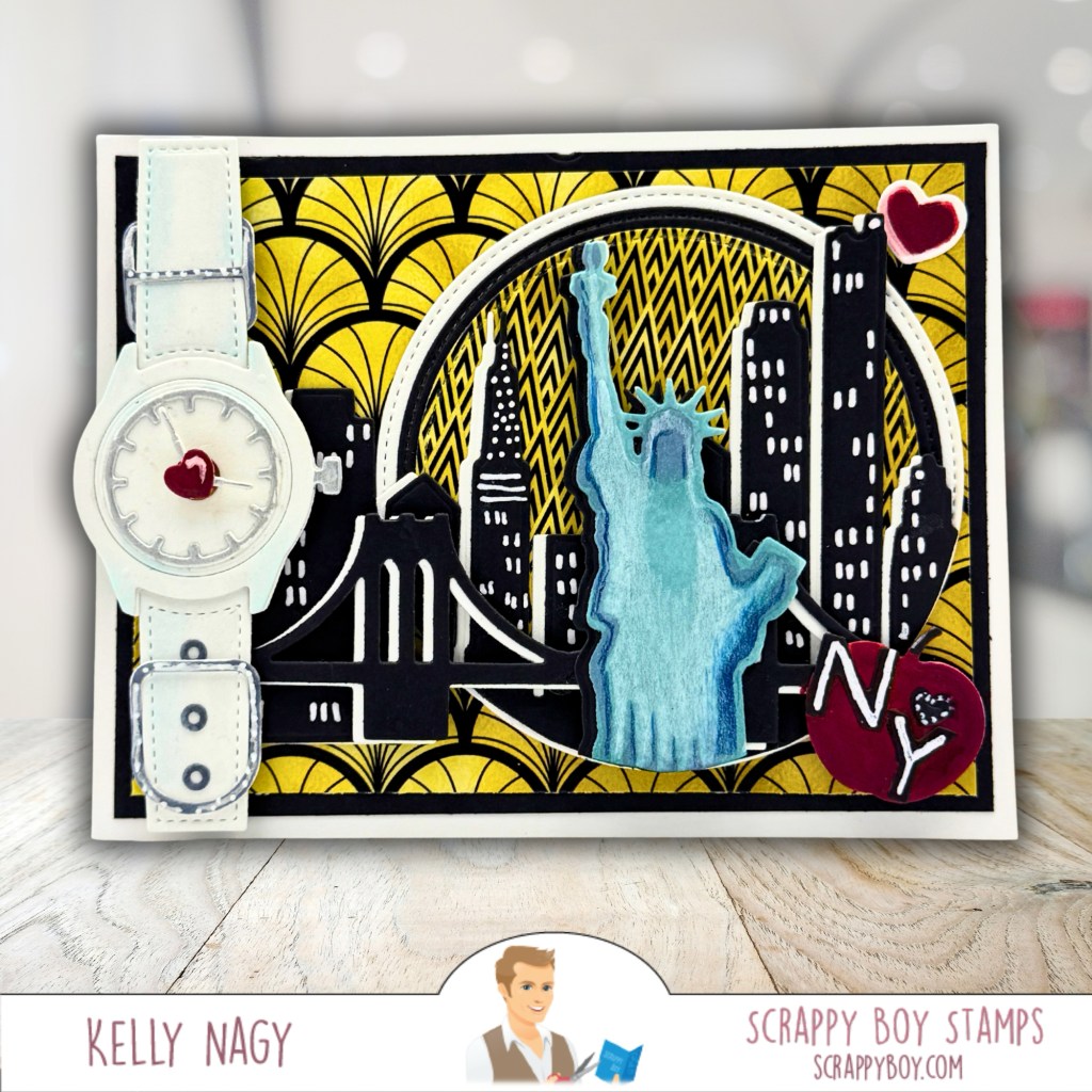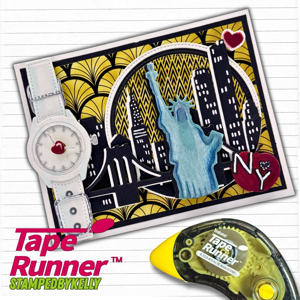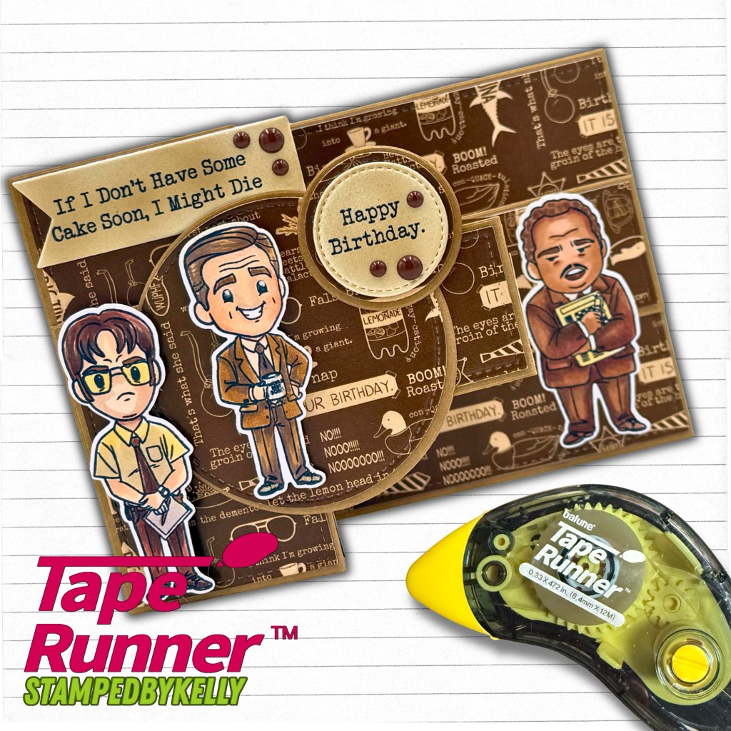
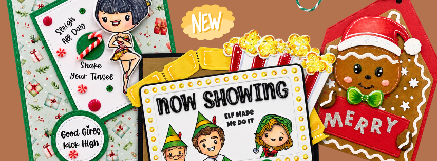
From running late to clocking in, these four Scrappy Boy projects are ready for a little adventure! I’m sharing the details, products used, and Copic color combos behind each one.
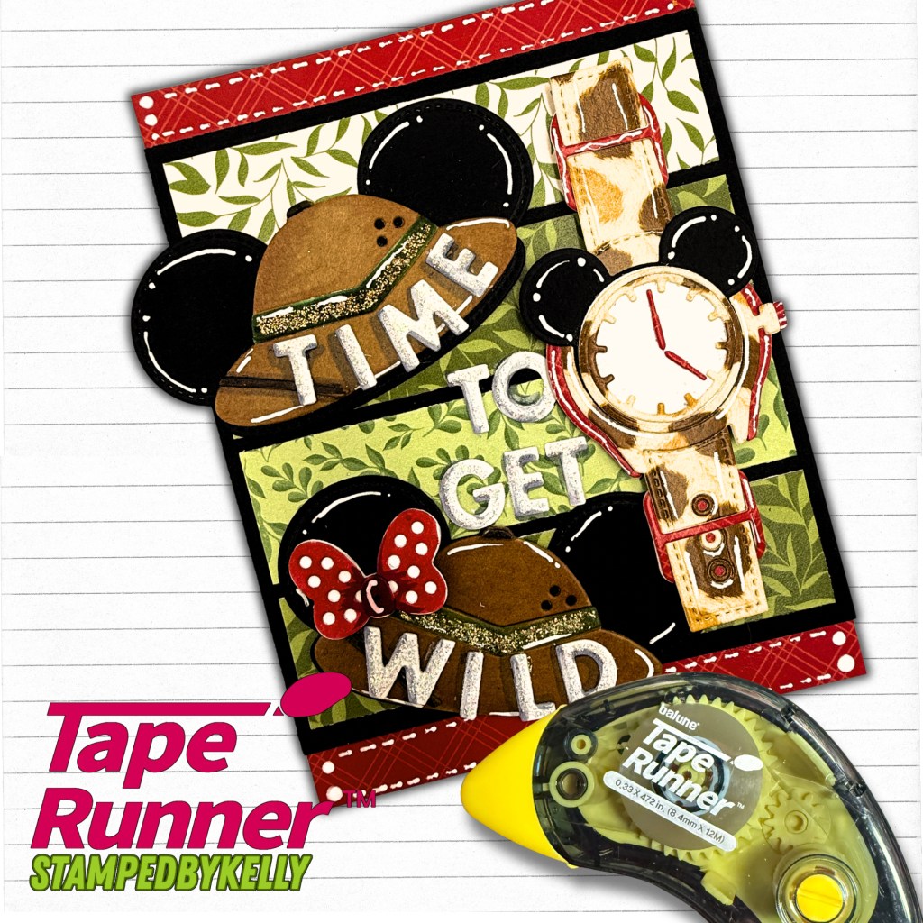
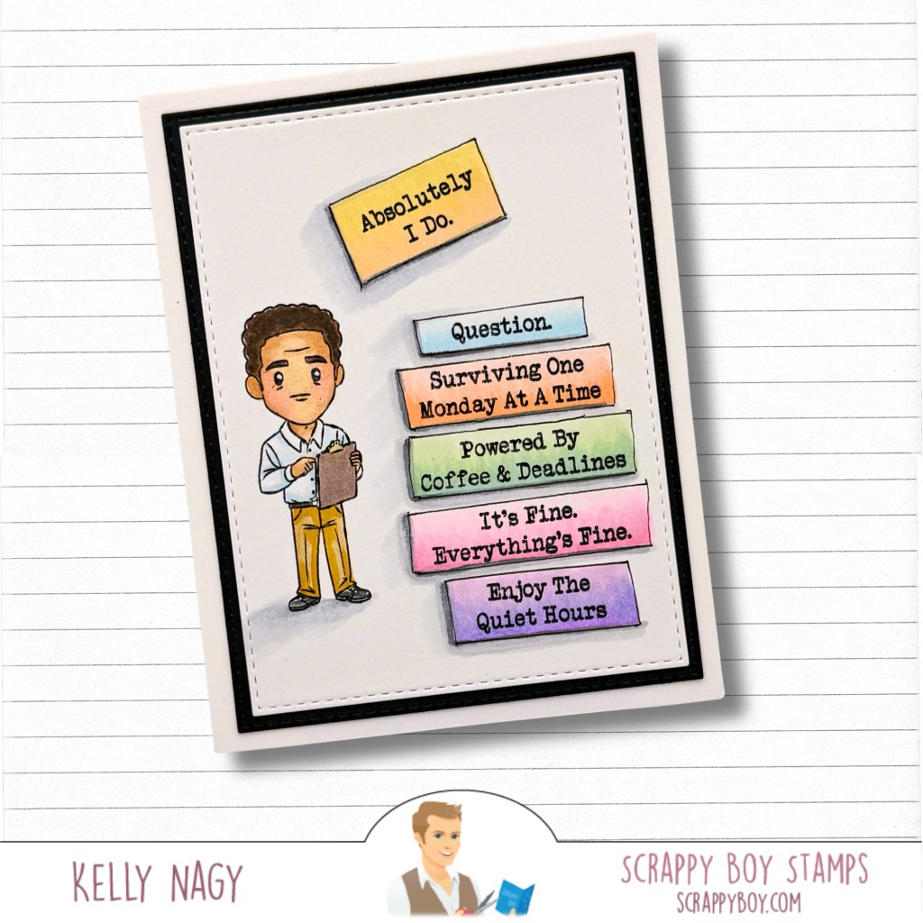
A rabbit with a clock, a watch in New York, and a few unforgettable coworkers—Scrappy Boy’s latest release gave me so many stories to tell! I made four separate projects, each with its own personality. I hope they inspire you to mix new products with the Scrappy Boy favorites already in your craft room.
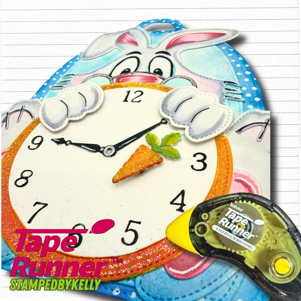
A Little Late? 🐰
That built-in clock makes this bunny backpack feel ready for an adventure down the rabbit hole! I had fun coloring the bunny and adding little white accents to the blue backpack. I love putting together the different elements, like a puzzle, with my handy-dandy dry adhesive tape runner from Tape Runner. Use code KELLY10 only at Tape Runnerfor 10% OFF your cart.
I added Stickles to a variety of elements for added interest and sparkle.
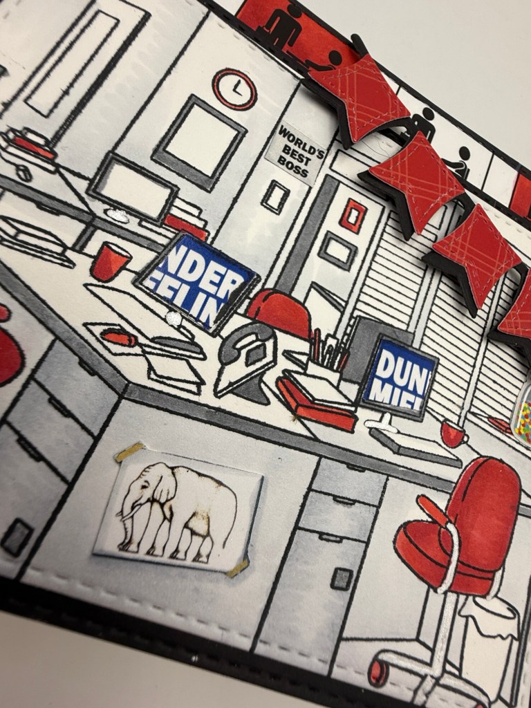
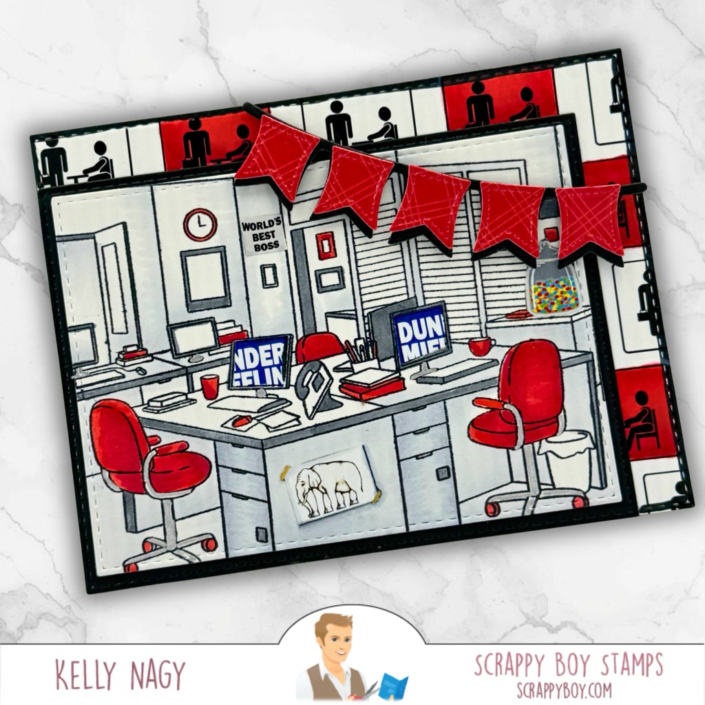
The workplace background stamp sets the scene for an office full of familiar little details. I kept the red, black, and white palette running through the whole card, from the chairs to the banner. I used elements from the coordinating paper pack to add visual interest and tie the stamp-set together.
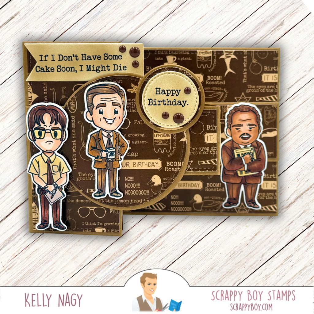
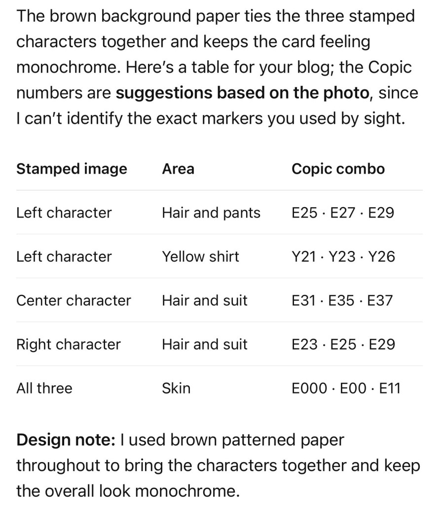
And what would an office release be without the coworkers? I brought a few of them together for a birthday card with plenty of personality—and a very relatable request for cake!
That’s what I love about a Scrappy Boy release: one product can spark an idea for another. The bunny’s clock led me to the watch, and the workplace scene led me straight to the coworkers. Which of these four projects is your favorite?
Create a colorful 3D Main Street Bin with Scrappy Boy Stamps! See how I used mouse-head dies to create dimensional building-brick details, plus my Tape Runner adhesive tips.
If you know me, you know I love taking a new die and finding a way to make it completely my own! For my latest Scrappy Boy Stamps Design Team project, I played with the NEW 3D Main Street Bin Builder, and this one was way too much fun. ❤️💛💙💚
Living here in Central Florida, I’m surrounded by theme-park inspiration, so I combined two things that immediately say FUN to me—bright building-brick colors and cute mouse-inspired details!
The 3D Main Street Bin Builder creates such a fun dimensional project, and I love that the PUSH flap actually opens!
For my version, I cut blocks of brightly colored cardstock to create the look of building bricks. But flat bricks weren’t enough. They needed studs!
Creating My Dimensional Bricks
Instead of traditional round studs, I reached into my Scrappy Boy stash and used tiny mouse-head dies from the Mouse Pizza Builder Die and Mouse Bumper Die Set.
I cut them from coordinating cardstock and added them to each colored section for dimension.
And yes…there are A LOT of tiny mouse heads. 😂 Totally worth it!
Of course, all those little pieces needed adhesive! My Tape Runner made quick work of assembling the bin, adding the cardstock panels and attaching all those tiny dimensional details.
A big thank you to Tape Runner for sponsoring my crafty adventures! 💕
✨ You can save 10% with my code KELLY10.
I kept the sides relatively simple so the colorful front could be the star. I also love seeing how this project comes together from the inside—it’s amazing what a few pieces of cardstock can become!
One Bin…So Many Possibilities!
The coordinating Main Street Bin Builder Mouse Add On gives you even more possibilities.
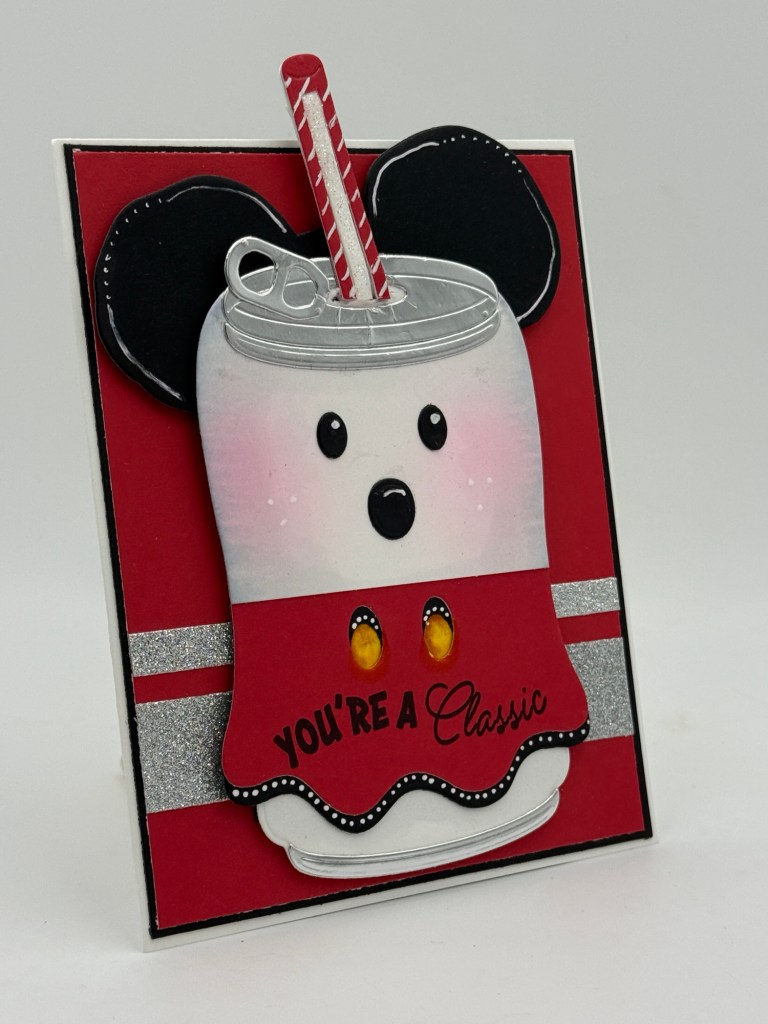
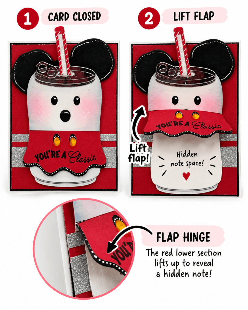
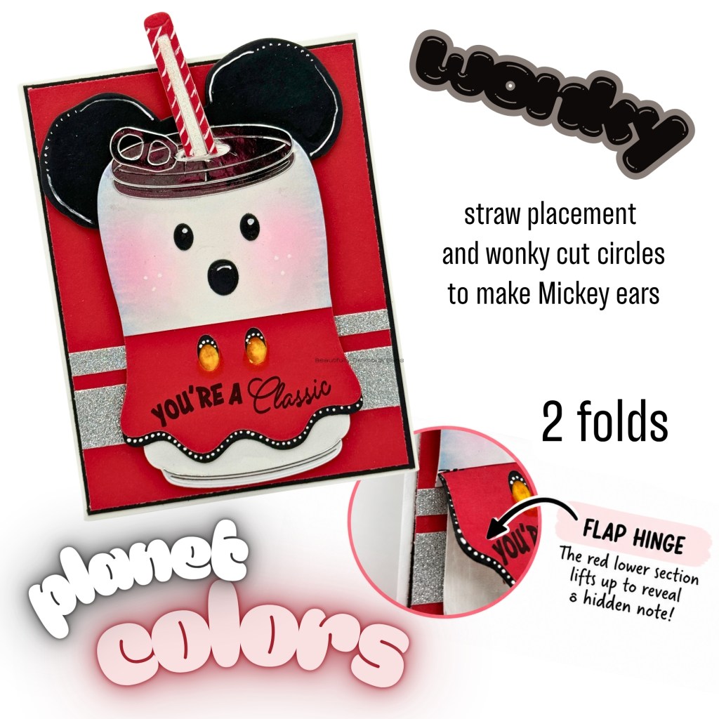
For this version, I used classic red, white and black with the ears, bow, gloves and polka-dot details. Same bin—completely different personality!
That’s probably my favorite thing about this die. Change the colors, papers and embellishments, and you can create an entirely different project.
Scrappy Boy Stamps Supplies Used
3D Main Street Bin Builder Die
Main Street Bin Builder Mouse Add On
Mouse Pizza Builder Die — used to create some of my dimensional mouse-head “studs”
Mouse Bumper Die Set — used for additional dimensional mouse-head “studs”
Adhesive Used
Tape Runner — used throughout the construction and embellishing of my project.
Get spooky cute with the Scrappy Boy Stamps August Release! I’m mixing stamps, dies, paper and a little unexpected inspiration to create Halloween projects filled with dimension, personality and fun—including a special treat box made for my grandson and one of our favorite Halloween traditions. 🎃🦇✨
If you know me, you know I LOVE finding unexpected ways to use my crafty supplies! Sometimes a stamp or die may have been designed with one idea in mind, but I immediately start thinking, “What else can I turn this into?” And living in Central Florida, it probably comes as no surprise that a little theme park inspiration frequently sneaks into my craft room!
For these projects, I pulled out some of the spooky-cute goodies from the Scrappy Boy Stamps August Release and gave them my own magical Halloween twist.
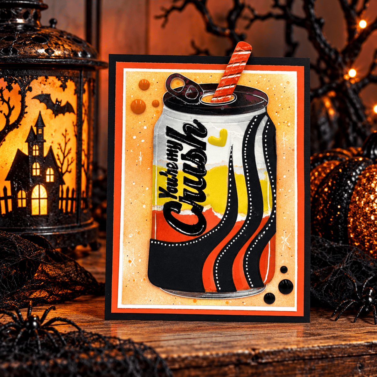
“Have a Wicked Good Time” Gothic Picture Frame card
The Gothic Picture Frame Die was perfect for framing one of the adorable images from Hex Appeal. I kept the traditional Halloween palette of purple, black, orange and white, adding little pops of sparkle to the spiderweb details. I love how the oversized frame makes the stamped image feel like a spooky portrait hanging inside a haunted mansion.
Mouse Bat card — “You’re the Treat I Was Hoping For
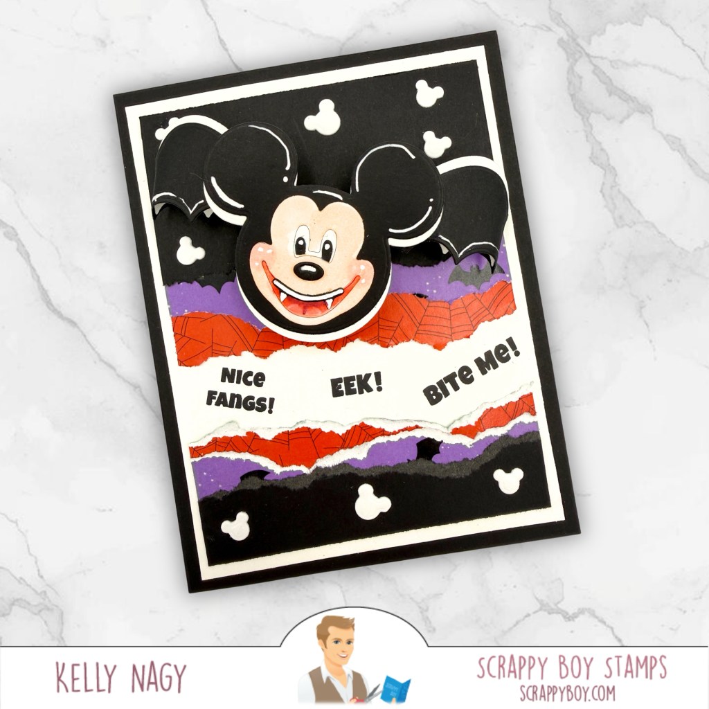
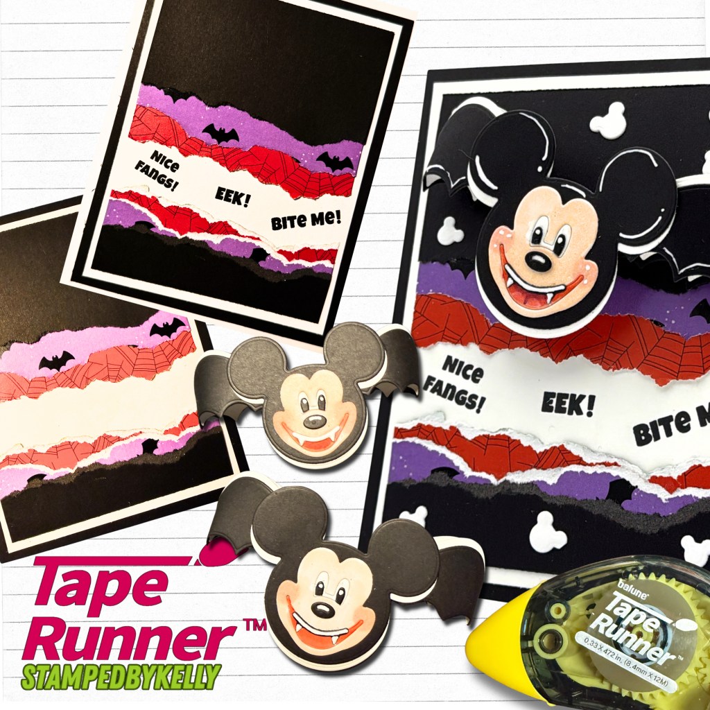
Then came those Mouse Bat Embellishment Dies! These were just begging for some theme park-inspired fun. I played with layers, patterned papers, torn edges and white gel-pen accents to create two completely different Halloween cards.
Mouse Bat card — “Nice Fangs! Eek! Bite Me!”
The dimensional bat ears make such a fun focal point, especially when paired with those classic Halloween colors. I especially love how differently the same basic die can look simply by changing the background, composition and embellishments.
And I couldn’t stop there!
Full Pumpkin Mouse project showing both the card and dimensional folio/box
The Pumpkin Mouse Backpack Add-On became the star of one of my favorite projects. Instead of treating it simply as a backpack element, I transformed that big pumpkin into a dimensional Halloween centerpiece and paired it with plaid and spiderweb papers. A little tissue paper and some fun halloween treats and gift cards and you have a decorative, heartfelt gift and memory holder once emptied.
Close-up of Pumpkim
Lots of ink blending, deep shadows, white gel-pen highlights, lovingly put together with my hand-held adhesive from Tape Runner and a little shimmer helped bring all of those layers to life. The close-up really shows how much dimension and texture can be added to simple paper die cuts.
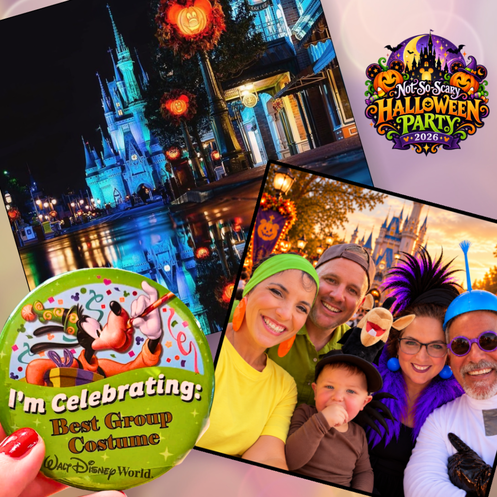
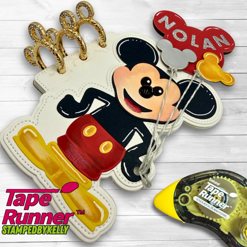
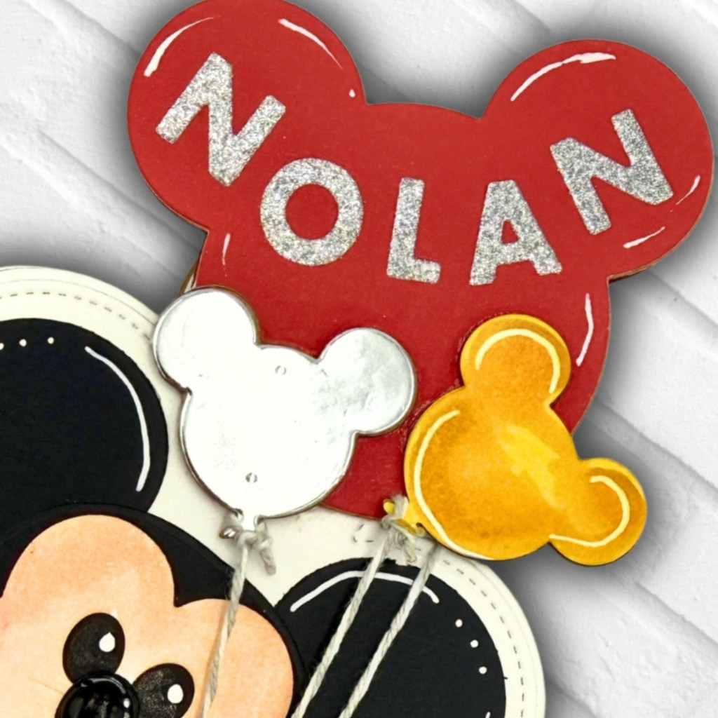
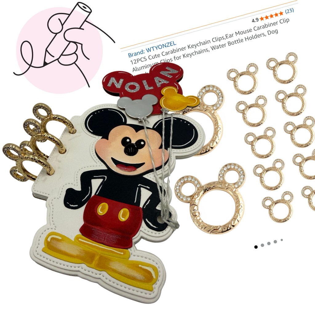
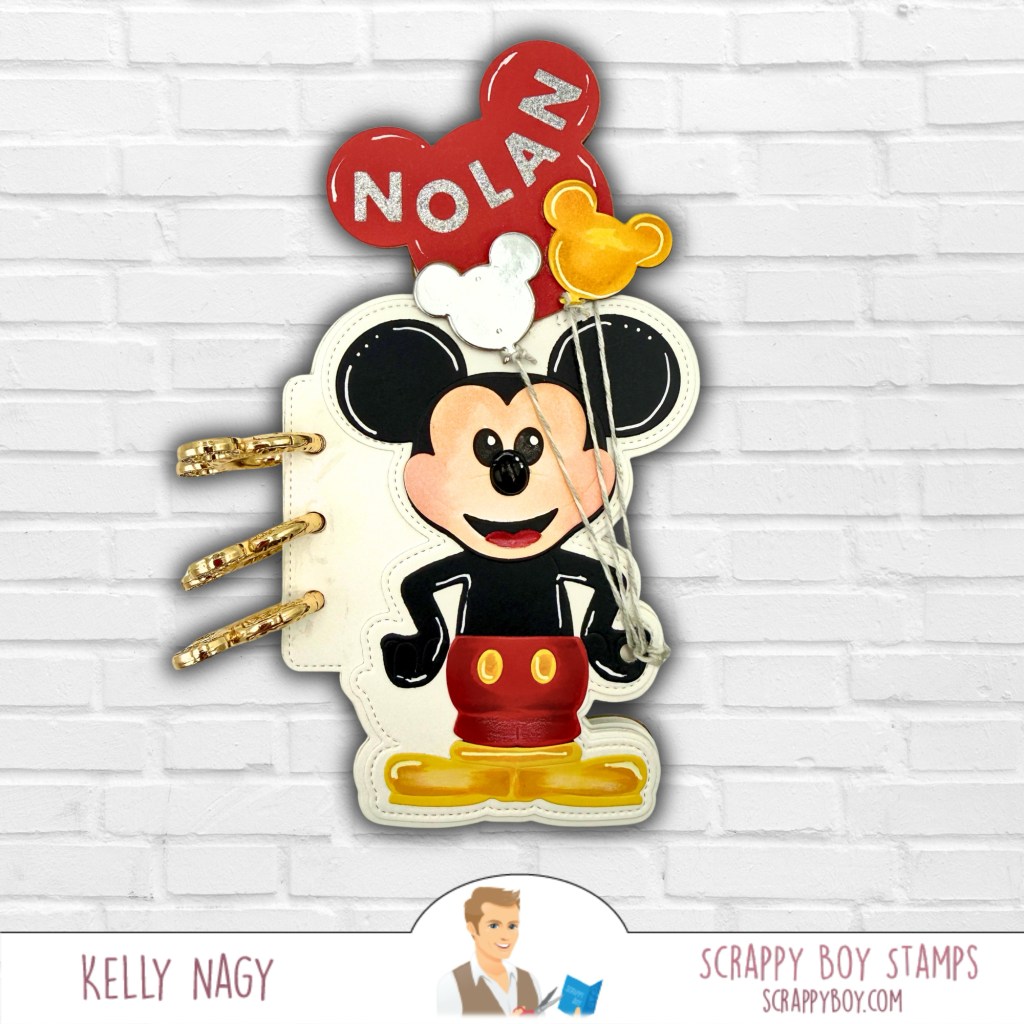
This treat box is especially close to my heart because I created it for our grandson, Nolan, as we prepare for our second annual visit to the Mouse’s Not-So-Scary Halloween Party at the theme park, a tradition that combines celebrating his birthday with officially kicking off the Halloween season here in Central Florida!
I personalized the back with his name and even pulled in the castle die from a previous Scrappy Boy Stamps release, which was the perfect way to add another little touch of magic. I love mixing pieces from different releases and finding completely new ways to use them, but even more, I love knowing that this project will become part of another special memory with our grandson. 🎃🏰🧡
Finally, I had to play with the Haunted House Folio. I went for an eerie-but-cute abandoned mansion look with weathered grays, soft lavender, glowing golden windows, bats, spiderwebs, a pumpkin and even a creepy little hand reaching up from below. It was easy to position and adhere the smaller pieces with my hand-held Tape Runner. This project has so many tiny details to discover!
That’s probably my favorite part about crafting: the dies give you the pieces, but your imagination gets to decide what they become.
I hope these projects inspire you to pull out your supplies and look at them a little differently. Mix collections. Change the intended theme. Add unexpected colors. Turn an embellishment into the focal point. Most importantly, have fun creating something that’s completely you.
See how the Scrappy Boy Stamps Haunted House Folio Die comes together layer by layer! I first build the entire haunted house in white cardstock and photograph each stage as a reference. Then I can take it apart, add all the spooky color and details, and assemble everything using my favorite TapeRunner.com handheld adhesive tape runners. Use code KELLY10 to save 10%.
There’s something spooky happening at Stamped by Kelly! 🦇🏚️
I love a die set that gives you plenty of room to make it your own, and this haunted house definitely delivers. I created two completely different looks to show just how versatile it can be.
For my first version, I went with a classic Halloween palette of deep purple, black, gray and bright spooky green. I added texture to the house panels and layered all of those fabulous little details—the bats, spiderweb, ghost, creepy hand, fence, pumpkin and more. The bright green windows give it that perfect eerie glow!
For my second version, I decided to get a little messier! I used a combination of inks, splatters and coordinating patterned papers from the Hex Appeal bundle to create a distressed, grungy haunted-house feel. I love how the oranges, purples and blacks work together while the bright yellow-green windows really pop against the darker colors.
One die set—two totally different haunted houses! That is exactly what I love about dies like this. You can keep it clean and coordinated or pull out the inks, patterned papers and splatters and make it wonderfully creepy.
The Haunted House Folio Dieis part of Scrappy Boy Stamps’ August release and is packed with details that make it perfect for Halloween cards, folios, albums, home décor and more.
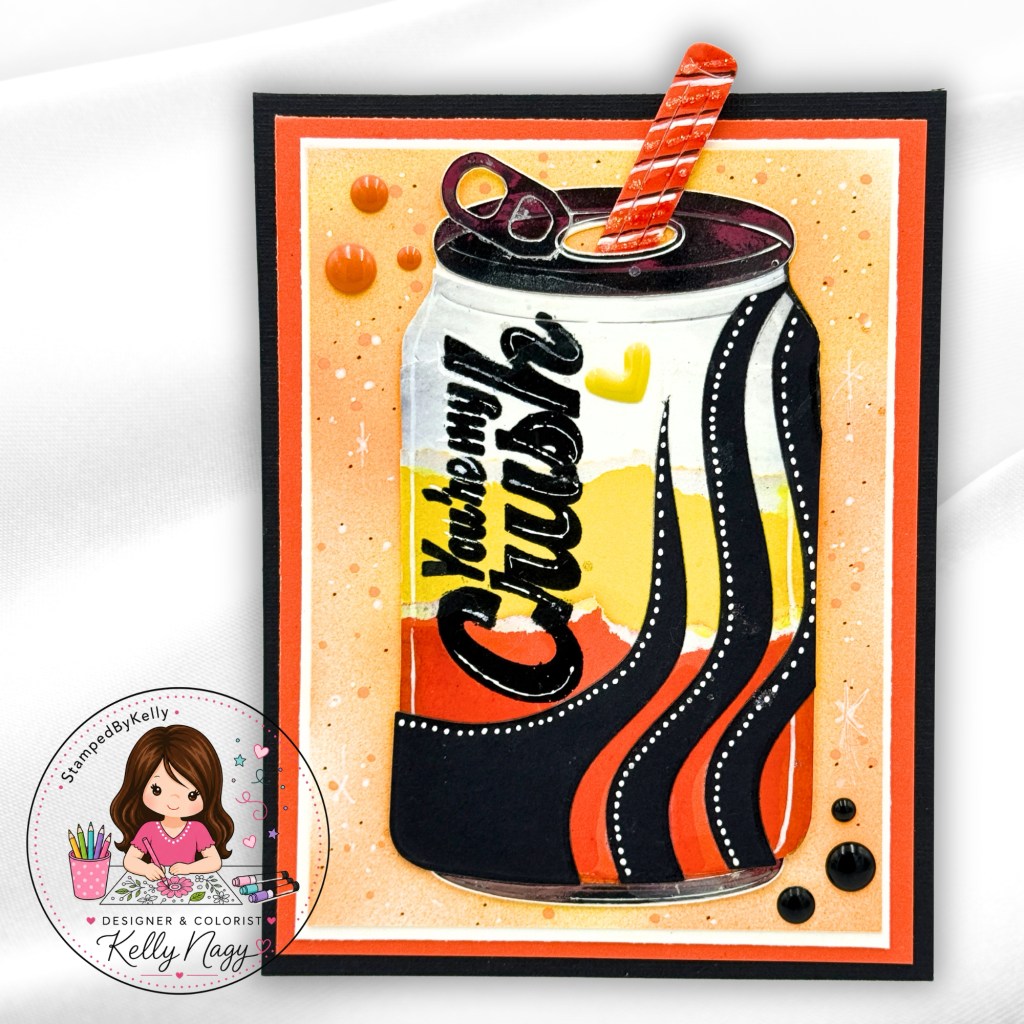
Each layer builds upon the next to create this fun Haunted House Flipbook/Folio. Before adding color or patterned paper, I like to:
🤍 Die-cut and assemble each layer in white cardstock to create a visual reference.
📸 Photograph each stage so I can easily remember how all those little pieces fit together.
🎨 Take everything back apart and decorate each panel individually with coloring, patterned papers, and embellishments.
🏠 Reassemble and permanently adhere each layer using my favorite handheld adhesive tape runners from TapeRunner.com.
This little extra planning step makes decorating a detailed project so much easier—and I have my photos to reference when it’s time to put the whole haunted house back together!
SAVE 10%: Use promo code KELLY10 when shopping at TapeRunner.com.
Create two colorful Halloween cards featuring the newest Scrappy Boy Stamps release—the Hex Appeal I Want It All Bundle, Spooky Bat Mouse Embellishment Die, Mouse Ears Alphabet & Numbers Dies and Gothic Picture Frame.
Halloween crafting is in full swing, and today I’m sharing two frightfully fun projects featuring the newest release from Scrappy Boy Stamps! From a charming vampire to the cutest little bat mice, these cards are filled with bright colors, playful details, and just the right amount of spooky sparkle.
Two Halloween cards featuring the newest release from Scrappy Boy Stamps
Hex Appeal August Sketch Challenge Card
My first project is squeaking in just in time for the final day of the Scrappy Boy Stamps August Sketch Challenge!
Scrappy Boy Stamps August 2026 Sketch Inspiration.
I used the Hex Appeal I Want It All Bundle to create this handsome little vampire card. The August sketch inspired the bold layout, including the vertical and horizontal cardstock strips and the large oval focal point.
The orange spiderweb paper and black skeleton pattern create a classic Halloween color combination, while the softly colored purple background helps the vampire stand out. The heat-embossed “Nice Fangs!” and “Bite Me!” sentiments add a playful finishing touch.
Hex Appeal Coordinating Paper Pack
A few sparkly embellishments, dimensional layers, and stitched details complete this fang-tastic design!
Close Up to show layers. Stitched Oval Nesting Dies from Scrappy Boy Stamps
Spooky Bat Mouse Embellishment Dies paired with the Gothic Picture Frame
These little bat mice are almost too cute to spook! I used bright green, purple, and black for a playful Halloween color palette and added white highlights to bring out the details in their wings and faces.
The Gothic Picture Frame creates the perfect backdrop, while the spiderweb accents, sparkly swirls, and bold BOO sentiment add extra texture and personality. The Mouse Ears alphabet dies are a cute addition and nod to the mouse! I love how the bright green border makes the entire card pop!
Glitter, white highlights, and whimsical die-cut details make these bat mice ready for Halloween.
Both projects show how easily the newest Scrappy Boy Stamps products can be mixed and matched to create Halloween cards ranging from delightfully spooky to cute and whimsical.
Suggested Copic combinations: Skin: E000, E00, E11, E13; hair and clothing: C3, C5, C7, C9; cape and wine: R29, R39, R59; and purple airbrushed background: V04, V06, V09. I used the Copic Airbrush System to create the soft purple glow behind the vampire.
I used my favorite dry adhesive from TapeRunner.com to assemble all the layers of this card. Shop their selection of crafty adhesives and use promo code KELLY10 to save 10% on your entire cart! This costs you nothing extra and helps support my creative journey.
Celebrate the life and legacy of Dolly Parton with a vibrant pink handmade tribute card filled with flowers, sparkle, and heart. This dimensional square card features Copic coloring, a softly blended background, heat embossing, layered die cuts, white gel pen highlights, metallic accents, and a bold butterfly—bringing texture, contrast, and plenty of Dolly-inspired pink to every layer.
Some cards are created for an occasion. Others are created simply because you feel the need to put a little love onto paper.
This card is PINK FOR DOLLY—a celebration of a beloved human being whose life brought so much color, joy, kindness, music and sparkle into the world.
For this square card, I shopped my own crafty stash and combined products from different companies, including Pajama Crafter Stamps and Scrappy Boy Stamps. I wasn’t concerned about keeping everything within one collection. I simply chose the elements that helped me create the feeling I wanted.
And, of course, there had to be PINK! Including my TAPE RUNNER!!
When the First Idea Doesn’t Quite Work
I originally stamped and heat embossed the large floral image from Together Stampsin silver on white cardstock using Lisa Horton Crafts Cloud 9 ink. It was beautiful, but once I began working with the image, I realized it didn’t have quite enough contrast for the bold, vibrant card I had envisioned.
Thankfully, I had left the stamp positioned in my MISTI Stamp Positioner!
Without moving the cardstock or the stamp, I was able to go right back over the original image and re-stamp it using black VersaMark pigment ink. I covered the freshly stamped image with clear heat embossing powder and heat set it.
That simple change made ALL the difference.
The black embossed lines gave me the strong definition and contrast I wanted while still allowing touches of the original metallic embossing to contribute to the texture and character of the finished image.
It’s also a great reminder: don’t be too quick to take that stamp out of your stamp positioner! Sometimes being able to re-stamp an image in exactly the same location can completely rescue—or transform—a project.
Bring on the Copics!
Before I had that beautiful dark outlines over the silver embossing, the colors just did not pop.
I wanted the flowers to feel vibrant and dimensional, with everything from soft pink highlights to rich raspberry and deep burgundy shadows. The butterfly carries those same pinks into deeper magentas and purples, creating a dramatic focal point against the softer pink background.
I added small white highlights and dots after coloring to emphasize the texture and give the images a whimsical, almost illuminated appearance.
And because this is Dolly we’re talking about, there was absolutely no reason to stop before adding a little sparkle!
The Butterfly Takes Center Stage 🦋
The large butterfly is from another Pajama Crafter Stamps set called Awareness Stamp Set and became the dimensional focal point of the card. I colored it in saturated pinks, magentas and purples, keeping the outer portions very dark so all of those bright colors would pop.
The white detailing adds another layer of contrast, and the metallic letters spelling DOLLY across the butterfly turned it into the centerpiece of the entire design. The alphabet die is from Scrappy Boy Stamps and is called Marquee Sign Die Set. I love it because all the letters of the alphabet are on one cohesive one die piece and you get the whole alphabet in one pass of your die cutting machine. Simply run it through as many times as you need to get all the letters, but then you can save all the extras for future cards. It’s a perfect size and is slightly smaller than the Scrappy Boy Alphabet Die. I set and I find it easy to read and must have for your collection.
I kept the additional sentiment beautifully simple:
Believe.
The sentiment is also from the Awareness Stamp Set. Sometimes one word says everything you need it to say.
A Little Metallic WOW
To finish the card, I created multiple layers around the floral panel using black, bright pink and a fabulous metallic diamond plate cardstock.
Living in Florida, humidity can be tough on paper, so I love using dry adhesive from Tape Runner to help minimize warping. It’s quick, clean, mess-free, and perfect for tossing into your craft bag for a crop. In honor of Dolly, I naturally chose PINK! 💕 Tape runners come in different sizes and refillable or disposable options, so it really comes down to personal preference. Shop Tape Runner and use KELLY10 to save 10% on your entire cart at no additional cost to you. Your support lets them know you were inspired by my project, and I truly appreciate it! 💗
That metallic layer was exactly what the design needed. It catches the light without competing with the flowers and gives the card just a little unexpected edge against all of those feminine pinks.
A few sparkling embellishments and glittery details in the flower centers brought everything together.
The finished square card is bold, feminine, dimensional, sparkly and unapologetically pink.
More than anything, though, it was created from the heart to honor the life of a beloved human being.
Believe. Love. Add a little sparkle. And when in doubt, make it PINK. 🩷🦋✨
Create a whimsical A2 Christmas card with the Cheers to the Season stamp set, simple masking, Copic airbrushing, and bold red, green, and blue backgrounds. Learn how to make playful postage-stamp scenes, color coordinating bear images, and add festive sparkle to your handmade holiday cards.
Sometimes the most fun cards begin with looking at your stamps in a new way! For this A2 Christmas card, I created a whimsical postage-stamp design with Waffle Flower’s Postage Die paired with the adorable Cheers to the Season stamp set, simple masking, and my Copic Airbrush System.
The Cheers to the Season stamp set is available from Pajama Crafter Stamps. Although I am no longer on their design team, they are a favored small business that offers whimsical stamps and coordinating products, including fun tools that can double as decor in your craft room. Be sure to check them out, and tell them Kelly sent you!
Finished Card Front
Creating the Postage Collage
The fun postage-style layout for this A2 card was created using the Waffle Flower Postage Collage Die. I love how the six connected postage areas create little spaces for each stamped scene while still coming together as one cohesive design. The die is currently listed as pre-order/backordered on Waffle Flower’s website. I am not an affiliate—I’m simply sharing the link for your convenience in case you’d like to check it out for yourself. (waffleflower.com)
I stamped the bears throughout the postage openings without worrying about perfect placement. Some peek in from the sides, turn sideways, or extend beyond the edges, giving each little scene its own personality.
Using the same stamp set in several different ways keeps the card playful and cohesive.
Masking and Airbrushing
To protect the stamped bears, I created simple masks with Post-it notes. Then I used my Copic Airbrush System to fill the openings with a bold Christmas palette of vibrant red, green, and blue.
The airbrush made it easy to build saturated backgrounds while keeping the images clean.
Mask your stamped images with Post-it Notes
Copic Airbrush Color Combinations
For the bold backgrounds, I used my Copic Airbrush System and layered a combination of colors rather than relying on a single marker. For the red backgrounds, I used R08, R27 and R46; for the green backgrounds, I used G03, G05 and YG09; and for the blue backgrounds, I combined B02 with fluorescent FB and FBG. Layering two or more colors within each color family gave the backgrounds more depth and variation while still keeping that bright, whimsical Christmas feel. I love how the airbrush allows the colors to blend softly without competing with the stamped images!
Post it note blocks ink overspray & allows for crisp white paper to finalize your coloring of images
❤️ Vibrant Red 💚 Bright Green 💙 Bold Blue
Keeping the Bears Simple
Because the backgrounds are so colorful, I kept all of the bears in the same warm brown color palette. This creates continuity and keeps their coloring from competing with the bold airbrushed backgrounds.
Copic Colors for the Images
To keep the colorful backgrounds as the star of the show, I kept my stamped images fairly simple and consistent. For the bears, I used E31, E33, E35, E37 and E29, creating warm brown tones with deeper shades for contrast and dimension. I also went ahead and took my YR23 marker over the browns on my bears to add some warmth and blend out the layers. For the festive details, I pulled from R27 and R29 for the reds, YG03, YG17, G05 and G07 for the greens, and E49 and 100 for the deepest shadows and details. Keeping the bears within the same color family helped unify all of the little postage-stamp scenes without competing with those vibrant airbrushed backgrounds.
I finished the bears’ noses with 3D GALAXY GLASS for a little extra dimension and shine. I also pulled out my WHITE GEL PEN and added dots for snow on the background. I adds texture, interest and a festive, snowy feel!
Assembling the Card
Once everything was colored, I assembled the layers with my TapeRunner Dry Adhesive. If you wish to purchase from there and receive 10% off everything in your cart, you can use promo code KELLY10 at check out.
Living in Florida means HUMIDITY! ☀️🌴 Whenever possible, I avoid adding extra moisture to my cardstock. A tape runner adhesive provides a clean, strong bond without the wet adhesive that can contribute to warping—especially on cardstock that has already been colored and airbrushed.
Finishing Touches ✨
I added the bold black “Merry Christmas” sentiment across the center, then finished the card with colorful Christmas lights, snowy splatters, sparkle, and shine. I colored the bulbs in coordinating colors and added some Stickles Glitter Glaze for some festive glitz!
Love the lights? They are from my Scrappy Boy Stamps‘ stash and I’m not sure if they’re available on their website any longer. There are plenty of other options to add bling or a festive element. All you have to do is think outside of the box and use what you have already.
I love how the finished design feels like a collection of tiny Christmas snapshots!
Remember, you don’t have to use a stamp exactly as you see it. Turn it sideways. Let it peek into a window. Mask it. Crop it. Airbrush around it. Finding new ways to use the stamps you already have is part of the fun!
I hope this inspires you to grab some Post-it notes, your favorite stamps, and your Copic markers to create something uniquely yours.
Get spooky-cute with the NEWEST Hex Appeal release from Scrappy Boy Stamps! See how I used the August Card Sketch Inspiration to create this Franken-Fine Halloween card, complete with patterned papers, stitched dies, heat embossing, and my Copic color combinations. 💚💜🎃
I’m popping in with a little spooky-cute inspiration featuring the NEWEST release from Scrappy Boy Stamps — HEX APPEAL! 🎃💜💚
Featuring Hex Appeal & Coordinating Products
For this card, I also took inspiration from the Scrappy Boy Stamps August Card Sketch. There’s still a little time to play along, so grab your favorite Scrappy Boy goodies and put your own spin on the sketch!
One of my favorite things about sketches is that they take away that “where do I start?” moment. You already have the bones of the design—you just get to make it yours!
My Take on the Sketch
I stayed fairly close to the original layout, using two contrasting patterned papers for the background and bold black cardstock to recreate the strong horizontal and vertical elements.
Of course, the star had to be this adorable little Frankenstein! 💚
I placed him inside an Oval Stitched Nesting Die and gave the background a soft purple blend using my airbrush attachment from Copic to help him pop without competing with the image. A few white splatters and sparkly accents finished off the background.
And how could I resist…
“You’re Franken-Fine!” 😂
Close up to see white gel pen accents
Copic Coloring
I colored my little guy with Copic markers, using bright yellow-greens for that classic Frankenstein look and deep violets and cool grays to coordinate with the Hex Appeal patterned paper.
The Hex Appeal 6×9 Paper Pack made this sketch especially fun. Mixing the green bats with the purple argyle gave me plenty of pattern and color while still allowing my stamped image to remain the focal point.
For the sentiment, I heat embossed “You’re Franken-Fine!” in white on black cardstock. The crisp white embossing against the bold black gives the sentiment plenty of contrast and ties in perfectly with the black elements from the sketch. 🖤
My Go-To Dry Adhesive ✂️
With all these fun layers, I reach for my TapeRunner dry adhesive! It makes lining up and layering cardstock quick and easy, while helping keep my panels smooth and warp-free—especially when working with multiple layers.
Want to give it a try? Use promo code KELLY10 for 10% OFF your TapeRunner purchase! 💕
Come Play Along!
Remember, a card sketch is meant to inspire you—not limit you. Change the shapes, flip the design, rotate it, add another layer or simplify it. There’s no wrong way to interpret it!
You still have a little time to join the Scrappy Boy Stamps August Sketch Inspiration, so get those stamps, dies and papers out and PLAY!
When you share your creation on social media, be sure to use:
Stretch your Christmas stamps beyond the holidays! See how simple color changes turn one festive stamp set into handmade cards for any celebration.
I have a new technique obsession to share today!
Example of what I used to create airbrushed backgrounds
I’ve been experimenting with my Copic markers and an air compressor attachment, and I LOVE the soft, blended backgrounds I can create. Even better? This technique is easy to customize simply by changing your colors.
Yes, it’s designed for Christmas—but who says it has to stay there?
🐱 Same Stamp. Different Celebration.
For one card, I embraced Christmas with festive reds and greens.
❤️ 💚 🤍 CHRISTMAS
Then I took the same MERRY MEOWMAS image, changed my Copic colors and added a few elements from my stash to create a Hanukkah-inspired card.
💙 🤍 💛 HANUKKAH
The air compressor attachment made it easy to coordinate each background with my Copic coloring. I simply sprayed light layers of color and gradually built the intensity until I was happy with the result.
No complicated blending—just spray, layer and have fun!
💙 Why This Project Is Personal
We are a blended family. My husband’s children from his first marriage were raised Jewish by their mom while also celebrating Christmas with us. Today, they have families of their own who continue to recognize both traditions.
That makes creating for different celebrations especially meaningful to me.
It also reminds me that our stamps don’t have to be limited by the holiday printed on the package!
❤️ 🖤 💚 KWANZAA
❤️ 🩷 🤍 VALENTINE’S DAY
🧡 🤎 💛 THANKSGIVING
🖤 🤍 💛 NEW YEAR’S
❤️ 🧡 💛 💚 💙 💜 BIRTHDAYS
Change the colors. Add something from your stash. Change the sentiment.
Make it YOUR celebration!
🎨 Try It Yourself!
Grab a stamp that was designed for one specific holiday and ask yourself:
“What ELSE could this become?”
For me, MERRY MEOWMAS went from Christmas kitties to a completely different celebration with little more than Copic color choices, some airbrushing and a few creative additions.
That’s exactly the kind of crafting I love—using what we have in unexpected ways!
Use KELLY10 for 10% Off your cart at TapeRunner.com
There is something I absolutely love about taking the same stamp collection and seeing just how different I can make it look simply by changing the colors, papers and card design. My latest projects featuring A Spoonful of Sweetness from Scrappy Boy Stamps were the perfect opportunity to do exactly that!
For these two cards, I went in completely different directions while keeping those adorable characters front and center.
Soft Blues, Toile & Shaker Windows
For the first card, I chose a soft blue and white palette with beautiful toile-style floral patterned paper.
I created a grid-style background with several sections transformed into shaker windows. The soft neutral shaker areas help break up the floral pattern while adding movement and just a little sparkle.
The sweet carousel character became the focal point, colored in coordinating blues, purples and warm golden tones. I added the “You Are A Spoonful of Sugar” sentiment on its own blue panel so it could overlap the grid and become part of the overall design.
The result is soft, feminine and a little bit vintage.
Rosy Vintage Florals
Then I completely changed directions!
For my second card, I pulled out warm vintage floral paper and paired it with black cardstock for much stronger contrast.
Instead of creating one large focal image, I divided the characters into individual stitched panels and layered them together over the floral background. Soft peach and rosy inked backgrounds tie the separate pieces together while allowing each character to have its own little moment.
And that penguin! 🐧
I couldn’t resist making him a prominent part of the design with the sentiment divided between the layered panels:
You Are A Spoonful of Sugar
A few sparkly embellishments, dimensional layers and white gel pen accents finished everything off.
Same Collection — Completely Different Personalities
This is one of my favorite things about stamping. Your patterned paper and color choices can completely change the personality of an image.
The first card feels soft, blue, elegant and whimsical, while the second feels warm, rosy, vintage and playful—but both began with the same adorable Scrappy Boy Stamps collection.
Products Featured
A Spoonful of Sweetness Stamp & Dies
Sweet Stroll Carousel Background Stamp
Scrappy Boy Stamps patterned papers
Stitched and layering dies
Shaker embellishments
Alcohol markers
White gel pen
Dimensional adhesive
You can find Scrappy Boy Stamps products directly at ScrappyBoy.com and through Scrapbook.com.
I would love to know which version you prefer: the soft blue toile shaker card or the rosy vintage floral card?