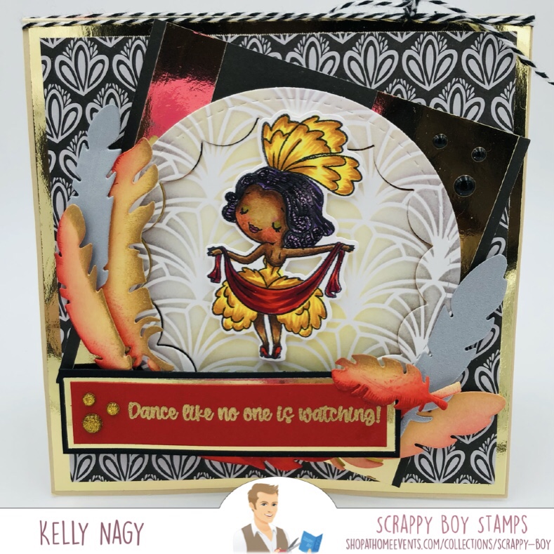
To create this card, you will need the following:
- Card Base – 4.25 in x 11 in (scored at 5.5 in) in white card stock 110 lb
- Black Matt – 4 in x 5.25 in
- Scrap black piece for sentiment. Strip should be at least 4.25 in long.
- Black and white scraps to die cut FLAG layers .
- White panel to create background panel for stamping and coloring, so use by our favorite for whatever medium you are using. I used Perfect Blend Alcohol Marker Cardstock in white. Final measurement is 3.75 x 5, but I use a slightly larger piece and then cut down.
- Stamp Anniething Chibi -You Drive Me Crazy
- Stamp Anniething Outline Die – You Drive Me Crazy
- Stamp Anniething Racing Dies
- Kawaii Cutie’s by Stamp Anniething – Love You Bunches Stamp Set
- Your favorite liquid adhesive
- COPIC Markers
- Memento Ink in Tuxedo Black
- White Embossing Powder
- Versamark Embossing Ink
- Double-Stick Foam Tape
- Perfect pearls, shimmer mist or similar product to flick on panel for added interest
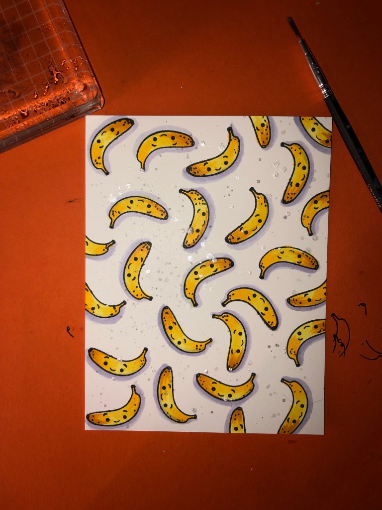
- Stamp banana stamp (there are 2 different ones in the set, the other is half peeled, either works)
- Color banana – Y13, Y15, Y17, YR24, added spots using N4
- Shadow under bananas – BV31
- Flicked on watered down black ink and Perfect Pearls mixed with water for added interest and a little sparkle & shine
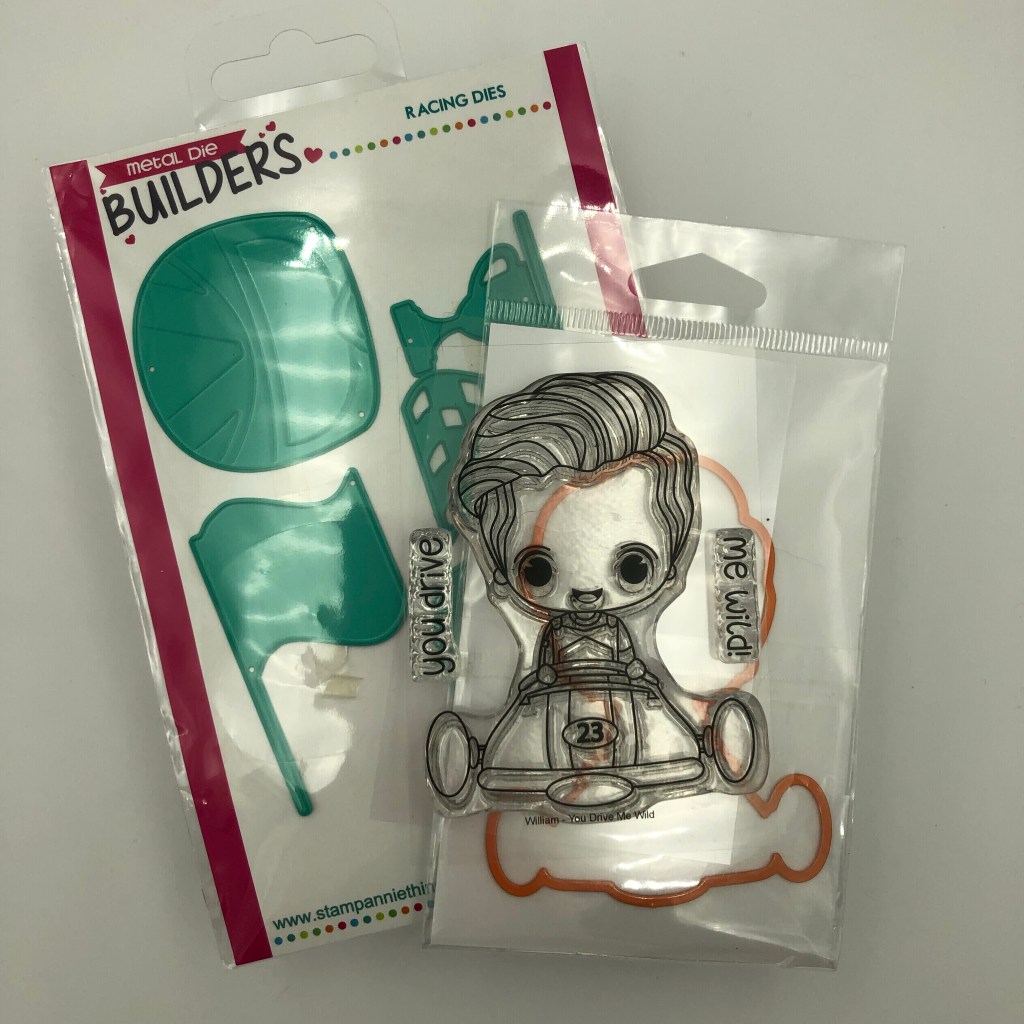
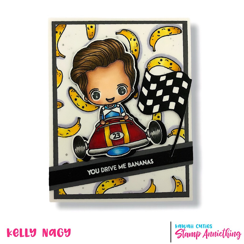
I stamped William – You Drive Me Wild on alcohol marker blending paper from Brutus Monroe. I colored image with Copic Markers and cut out with the coordinating outline die. I also cut out the flag (solid) in white and the checkered layer in black and adhered together to create the checkered flag.
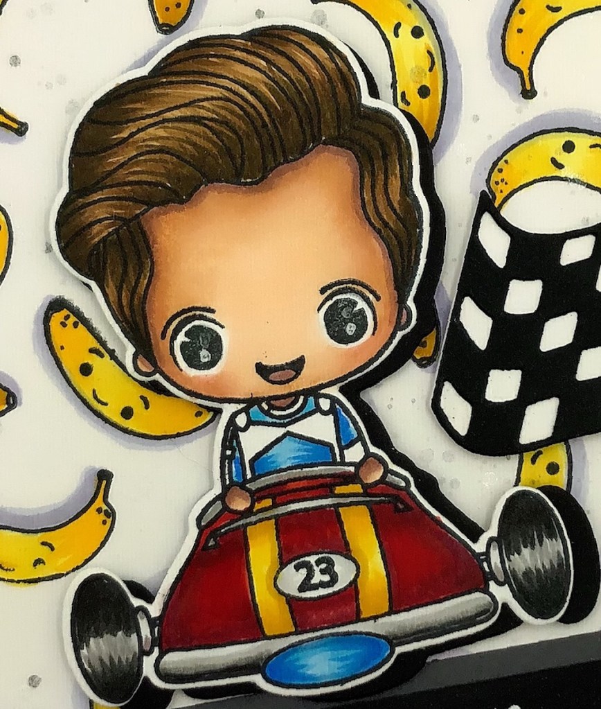
COPIC Combos are as follows:
- Skin Tones – E04, E11, E21, E00, R20 (cheeks) and E000
- Hair – E89, E59, E34, E57
- Blue – B000, B21, FBG2, FB2
- Red – R20, R24, R29 and R39
- Yellow – Y13, Y15 and Y17
- Tires & Chrome -T9, T7, T,4, T2
William was popped up with double-stick foam tape. As well as the checkered flag and sentiment. The sentiment was heat embossed on a strip of black paper with white embossing powder using my Stamp Anniething HOT PINK heat gun and then adhered to the banana panel, I previously created, at an angle and used as a grounding or landing spot for the main image.
Happy Crafting!!