
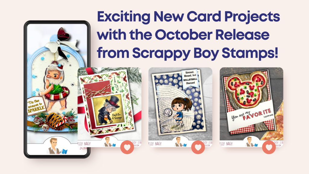
I’m absolutely thrilled to share my latest card projects featuring the October release from Scrappy Boy Stamps! Each project highlights just how versatile these products can be when paired with older release dies and new goodies.
Unique Creations: Stretching My Crafting Stash
Creating unique projects is my passion, and I love pairing unlikely sets together to come up with alternative ways to use my supplies. This approach not only stimulates my creativity but helps others stretch their stash too! Here’s a closer look at some of the projects I’ve crafted in preparation for this month’s release!
SCRAPPY BOY Supplies Used:
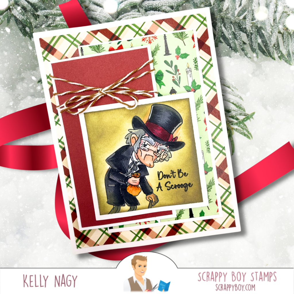
- CHRISTMAS CAROL Stamps & Outline Dies
- Scrappy Boy Stamps card-making die A2 NESTED STITCHED RECTANGLES
- Background 6×6 Patterned Paper Pack
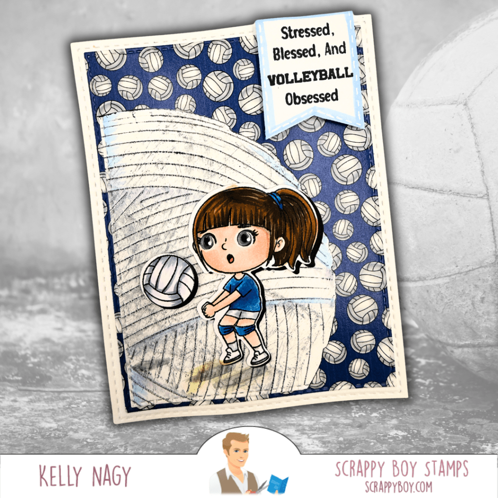
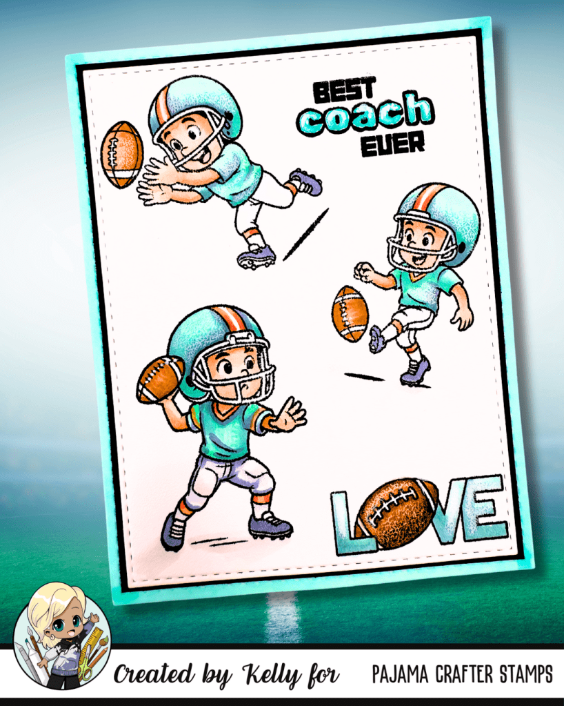
SCRAPPY BOY Supplies Used:
- CUTE KIDS – I LOVE SPORTS stamps & coordinating outline dies
- YARN BALL MINI ALBUM CARD DIE
- STITCHED RECTANGLES A2 NESTING DIES
- 6×6 COORDINATING PAPER PACK

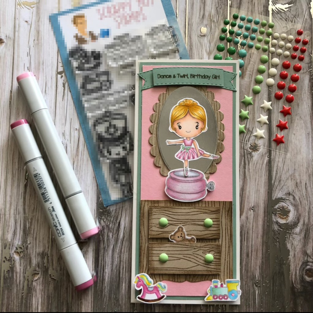
SCRAPPY BOY Supplies Used:
- MOUSE PIZZA DIE SET
- MAGIC MIRROR MINI ALBUM CARD DIE
- 6X6 Paper Pack – miscellaneous from prior release

SCRAPPY BOY Supplies Used:
- BUTT-CRACKER SUITE stamps and coordinating outline dies
- A2 DOME MINI ALBUM & CARD DIE
- WREATH ADD-ON ENVELOPE POP-UP DIE
- Sentiment from NICE LIST Stamps.
- INK ON 3 -NO LINE WATERCOLORING INK
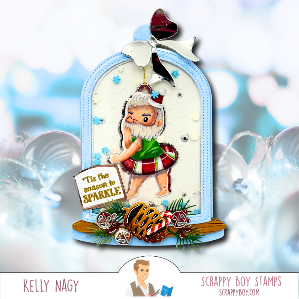
This month, I’ve utilized a no line coloring technique on the Butt Cracker Suite images, transforming them into adorable figures lounging in inner tubes! Who knew a ballerina tutu could double as a swimming tube? And one of the images was a perfect fit to create a Santa in a peppermint-colored inner tube, making it ideal for a holiday ornament—especially fun for those crafty friends celebrating the holidays in warmer climates! 😂🌴
Together, let’s get creative and explore new crafting possibilities with our supplies! Follow along for more inspiration! Follow me @stampedbykelly on Social Media. Ask me questions and let’s inspire each other together!


